Should You Only Buy Strong Sectors? What the Sector Tailwind Really Buys You
Stan Weinstein's rule: check the sector before the stock – staring only at one company's chart means seeing the trees, not the forest. We re-ran that rule against two recipes already tested in this series, on two sector levels, across almost 10,000 decomposed trades. The verdict: the sector tailwind is real and measurable – but it improves neither recipe reliably: Weinstein's light, which rates a sector as strong or weak off its 30-week moving average, trails a simple ranking of sectors. And for the recipe that buys after crashes, the weak sector of all things was the better pond. Anyone hoping for a sector filter here will be disappointed: in these two measurements the individual stock mattered more than the group.
 Thomas Mücke
Founder & Publisher
Thomas Mücke
Founder & Publisher
The question sounds like common sense: isn't it better to buy a stock from a sector that currently has tailwind, rather than one from a weak group? Stan Weinstein made exactly that claim a rule in his book "Secrets for Profiting in Bull and Bear Markets" – and we tested that rule against two buy recipes already published in this series: the Crash Reversal Backtest and the Revenue Inflection Backtest. This analysis summarizes the core findings for readers; the full calculation with every table lives in the detailed study.
Weinstein's answer: the group pulls the stock along
Weinstein's chapter on this is titled "Forest to the Trees" – staring only at one stock's chart means seeing the trees, not the forest. His claim: a strong stock in a weak sector rarely stays strong for long, while a weak stock in a strong sector often gets pulled along. His central tool is the 30-week moving average, which he describes as a minimum requirement for a purchase:
"Stocks trading beneath their 30-week MAs should never be considered for purchase, especially if the MA is declining."
— Stan Weinstein, "Secrets for Profiting in Bull and Bear Markets," McGraw-Hill, 1988, Chapter 1.
Weinstein applies the same stage logic to the industry group in his "Forest to the Trees" chapter – taken together, that means checking the sector before every single purchase. That is exactly what we mechanized and tested.
How we measured it
So the test could not be bent into shape after the fact, we fixed the rules and the success criterion in writing before running the numbers. We measured at two levels: 11 GICS sectors as a coarse breakdown, and, as a follow-up test, 74 GICS industries as a fine breakdown. Each level has two competing tools – a stage engine that mirrors Weinstein's 30-week logic (Stage 2 = strong sector, Stage 4 = weak sector), and a simple 6-month ranking that splits every sector into an upper and lower half by trailing return. Both tools were turned loose on two finished recipes. The reversal recipe buys stocks after a heavy crash and exits at an 11% profit target, or after 12 trading days at the latest – 9,908 trades. The revenue-inflection recipe buys stocks of companies whose organic revenue growth is just accelerating – 277 positions in the main arm, called the "narrow core" below. How many trades drop out for lack of a sector label, and how to read the percentages, is set out in the fine print further down.
Finding 1: the tailwind is real – but on average the individual stock carries the gain
The first finding proves Weinstein right: across 852 scorable weeks per sector – the sector index runs from April 9, 2010 to July 31, 2026, a good 16 years – almost 8 percentage points separate the weakest sector (Communication Services, 8.20% p.a.) from the strongest (Information Technology, 15.93% p.a.). Where a buy recipe does the least selecting of its own – in the broad signal arm of the revenue-inflection backtest, with 2,693 positions rather than the 277 of the narrow core – the stage traffic light separates entries by 24.29% against 4.27% a year. That is measured across 1,349 against 546 positions; on the stricter calculation excluding suspicious price jumps, 14.05% against 4.21% remain. The sector tailwind is not a rounding error.
That large gap does not contradict the rest of this article – it explains it. The broad signal arm takes in practically every position carrying a signal and does almost no selecting of its own. There the sector traffic light merely catches up on what a sharply honed recipe already does by itself: weed out the weak candidates. Once the recipe selects strictly on its own, a sector filter has nothing left to do – which is exactly what the next finding shows.
But decomposing every single trade into sector tailwind and stock-specific rest immediately reveals its limit: among the reversal recipe's winning trades, 9.4 of 11.0 percentage points of gain come from the rest on average – only 1.6 points from the tailwind, a good 14 percent. For revenue inflection the tailwind share is larger but still the minority: 36.9 of 50.2 percentage points of gain come from the rest on average, roughly 26 percent from the tailwind – a mean carried by a few large winners. The sector helps push, but picking the right stock decides the profit.
Finding 2: the stage traffic light does not beat the simple ranking – at either level
For the stage traffic light to count as "measurably better" than the simple ranking, we had fixed a rule before running the numbers: the Stage-2 filter (strong sector) had to beat the ranking variant in both recipes, and the control group (weak sector only) had to be correspondingly worse. The first condition fails at both levels. The second fails at the coarse level for both recipes: for the reversal recipe the weak sector beats the strong one throughout, and for revenue inflection both control groups sit above the filters they were meant to fall short of.
At the coarse level, with 11 sectors, the comparison looks like this. The two recipes measure different things: for the reversal recipe the figure is the edge a single trade achieves over the S&P 500 on average across its holding period – with the most extreme 2.5 percent at each end capped, so that single outliers do not carry the number. Not an annual figure. For revenue inflection it is the return of a portfolio per year.
| Variant | Reversal recipe: edge over the S&P 500 | Revenue inflection: portfolio return p.a. |
|---|---|---|
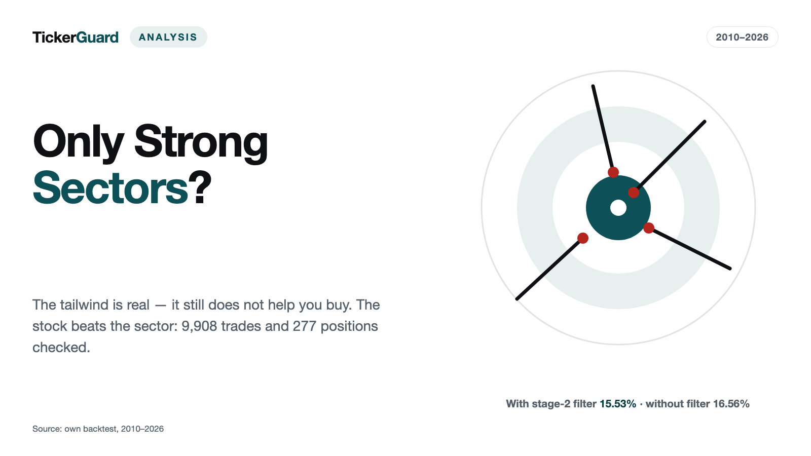
| no sector filter | +1.87 points | 16.56% |
| simple ranking (upper half) | +2.24 points | 15.71% |
| stage traffic light (strong sector) | +1.93 points | 15.53% |
| control: lower ranking half | +1.51 points | 16.34% |
| control: weak sector | +2.55 points | 17.22% |
Reversal recipe: 3,351 trades under the light against 4,473 under the ranking, out of 9,908 in total. Revenue inflection: 160 positions under the light against 127 under the ranking, out of 277 in total; conservative calculation. The controls rest on 5,246 and 2,695 trades for the reversal recipe, and on 141 and just 33 positions for revenue inflection – those 33 are too few to draw anything from.
In both columns the stage traffic light sits behind the ranking – that is the core of the finding. Its tiny edge over the unfiltered reversal recipe – 0.06 points, namely +1.93 against +1.87 – also costs the light a lower median trade return (+6.39% to +5.28%) and a lower hit rate (from 66.6% to 64.3%); that means the share of trades that end in profit at all, not the target-hit rate further down. Whether 0.06 points is anything more than noise cannot be said from these figures – what holds is the order, not the exact amount.
The bottom two rows are the control, and it fails: the weak sector and the lower ranking half were supposed to do worse than their counterparts. For the reversal recipe the weak sector, at +2.55 points, instead sits 0.68 points AHEAD of the unfiltered recipe and is the best row in the whole table.
A follow-up test at the finer 74-industry level changes none of this. For the reversal recipe, the Stage-2 filter still trails the ranking variant, at +2.08 against +2.25 percentage points – the same order as at the coarse level. For revenue inflection, only the comparison against the unfiltered portfolio flips: there the stage traffic light – again on the conservative calculation – reaches 16.66% (153 positions) and thus sits narrowly above the unfiltered recipe for the first time – but the ranking variant still achieves more, at 23.06% (132 of 277 positions). So the order stays the same: ranking ahead of the light. And the ranking variant's outlier is not to be trusted: the recipe's second portfolio arm (a second, similarly built portfolio from the same study) shows the exact opposite sign in the same calculation – there, the lower ranking half leads instead of the upper. A filter whose sign depends on which stock segment you look at is measuring noise in the data, not a reliable rule.
Finding 3: the Stage-4 paradox – the weak sector as the better pond
The most surprising finding concerns precisely the reversal recipe, which specifically buys stocks after a crash. There the expected direction flips entirely: Stage 4, the weak sector, is the best subset in the entire reversal table, with a median trade return of +10.43% across 2,695 trades – the strong sector reaches only +5.28% on the same measure, the unfiltered recipe +6.39%. Its target-hit rate – the share of trades that reach the 11% profit target instead of expiring after 12 trading days at the latest – is 52.2%, against only 41.5% for the strong sector (Stage 2, N = 3,351).
The most plausible explanation: in a weak sector, the preceding crashes tend to run deeper on average, and a bounce from further down covers proportionally more ground. For a recipe that specifically buys the crash, the "tailwind" idea therefore paid off in reverse in this measurement. One caveat matters here: this finding was not pre-registered but surfaced only on inspecting the numbers. That makes it an observation, not a trading rule – it would first have to hold up on independent data.
Why measuring more finely does not rescue the filter
The obvious objection to everything above: 11 sectors are too coarse – "Information Technology" throws semiconductor makers and software vendors into the same bucket. So we repeated the same test one level down, with 74 industries instead of 11, without changing a single rule. The result stays as described above: the filter does not beat the ranking.
The fine level also comes at a price: in any given year only about 55 of the 74 industries are measurable at all – twelve never reach the required number of members. And coverage is considerably thinner for delisted stocks than for those still listed today: only 40.3% of delisted names carry a fine industry label, against 91.4% of active ones. That tilts the fine level toward a flattering picture – it shows more how survivors performed than how the industry as a whole developed. That matters less for differences between filter variants than for statements about the level of returns, but it is one more reason not to trust the single positive outlier for revenue inflection at the fine level.
What this means for investors
For the two buy recipes tested here: picking the right stock beats betting on the sector. In this measurement the sector traffic light was not the better tool as a buy signal – at neither the coarse nor the fine level – the simple sector ranking beats it at both levels, and for the reversal recipe it is the weak sector, of all things, that comes out ahead of the strong one. That does not mean sectors are irrelevant to stock returns – the tailwind is real, and at times sizable – only that it fades exactly where a buy recipe already selects stocks carefully on its own. In the two recipes tested, buying in strong sectors produced no measurable advantage. The reverse rule – deliberately buying in weak sectors – explicitly cannot be derived from this measurement: it was not pre-registered but emerged only on inspecting the numbers. A finding made after the fact deserves the same scepticism as the outlier at the fine level – it would first have to hold up on independent data.
The fine print: how to read the numbers
The revenue-inflection recipe is calculated in several portfolio variants: the narrow core takes only the strictest signals, the broad signal arm takes practically every position carrying a signal, and a second, almost identically built portfolio bundles the same idea for already-established growth names. All percentages for this recipe in the filter tables are portfolio returns per year, computed across the 163 months from January 2013 to July 2026; the decomposition figures are averages per position across its holding period. Where "conservatively" appears, positions whose monthly return exceeds 200% are excluded – they are suspected of reflecting a data error rather than a genuine price jump.
On coverage: a small share of trades carries no sector label – 1.4 to 5.4 percent, depending on level and recipe. At the finer level, some trades additionally lack a sector stage before entry, or their industry never had an index of its own; there a good 8 percent of trades drop out of the filter variants. All of them stay in the unfiltered comparison. And the stages do not cover every trade: besides the strong sector (Stage 2) and the weak one (Stage 4) there are the intermediate stages, where the remaining trades sit. That is separate from coverage at the level of individual stocks: there, at the fine level, only a good half of all names carry a sector label at all.
Limitations, stated plainly
- The sector assignment is current-day and static. Every company gets a sector from today's classification, applied across the entire history – this analysis does not capture regrouping over time.
- The sector indices are equal-weighted, not cap-weighted. A small-cap name counts exactly as much as a sector heavyweight.
- We do not have Weinstein's full text. The stage definition quoted above comes straight from the original; for the chapters where he develops the industry-group analysis we rely on secondary literature.
- Both buy recipes are mechanized rules. Whether a discretionary investor using Weinstein's full methodology (including relative strength and trading volume, neither of which is used here) would get different results is not tested by this analysis.
The full calculation, with every table, the pre-registered decision rule, and the complete follow-up test, lives in the detailed study, "Sector Tailwind Tested". Readers who want the two underlying buy recipes in full can find them in the Crash Reversal Backtest and the Revenue Inflection Backtest.
Figures as of August 9, 2026; follow-up test at the fine industry level August 10, 2026.
This article is a historical analysis of publicly available price and fundamental data and not investment advice. It contains no buy or sell recommendation and no forecast; individual companies named in it serve solely to illustrate historical price patterns. Past results — whether simulated or real — are not a reliable indicator of future returns. Anyone making investment decisions should assess their own situation and risks, if in doubt with professional advice.
Frequently Asked Questions
For the two buy recipes tested here, the answer is no. A filter for strong sectors improves neither recipe reliably – in both cases the simple sector ranking outperforms Weinstein's stage traffic light. For the reversal recipe the weak sector actually outperformed the strong one; that finding, however, was not pre-registered but surfaced only on inspecting the numbers – it is an observation, not a trading rule. Sector membership does not replace picking the right stock.
In his 1988 book, Stan Weinstein argues that the industry group matters more than the individual stock: a strong stock in a weak group rarely stays strong for long, while a weak stock in a strong group often gets pulled along. His metaphor is the forest and the trees – look at the group first, then the individual name.
Yes, clearly measurable. Across 852 weeks – a good 16 years, from April 2010 to July 2026 – almost 8 percentage points separate the weakest from the strongest sector. Where a recipe does the least selecting of its own, the stage traffic light separates entries by 20 percentage points (24.29% against 4.27% per year; on the stricter calculation excluding suspicious price jumps, 14.05% against 4.21%). The tailwind is real – it simply stops helping once a buy recipe already filters stocks sharply on its own.
The reversal recipe specifically buys stocks after a crash. In a weak sector, those crashes tend to run deeper on average – and a bounce from further down covers proportionally more ground. In this measurement the weak sector therefore hit its price target in 52.2% of cases instead of 41.5%. Important: this finding was not pre-registered but emerged only afterwards, on inspecting the numbers. It is therefore an observation and explicitly not a trading rule – deliberately buying in weak sectors cannot be derived from it; the rule would first have to hold up on independent data.
No. Even with 74 GICS industries instead of 11 sectors, the stage filter still trails the ranking for the reversal recipe. For revenue inflection the stage traffic light there sits narrowly above the unfiltered recipe for the first time, but still stays behind the ranking. And the ranking's edge flips sign in the recipe's second portfolio arm – a sign of random noise, not a reliable rule. The fine level also covers barely more than half of all stocks, and only a good 40% of delisted ones – measured across stocks, not trades.