Phoenix Stock Backtest: Two Recovery Signals Together Beat the Crisis Cohort Most Clearly — and Almost Only for the Larger Names
A genuine phoenix stock has years of losses and at least one hard sign of balance-sheet distress behind it — the share price plays no role in this definition on purpose. We ran 7,814 such crises in US stocks since 2001 and pitted four numerical signals against each other: the first profitable year, positive cash flow ahead of earnings, accelerating revenue, and the start of deleveraging. The double signal of at least two of the three more demanding signals beats the crisis cohort — the hard benchmark of "blindly buy every written-off company" — most clearly at all four holding periods tested, at 20.23% a year on a twelve-month hold against 14.23% for the cohort. The catch: that edge carries almost exclusively above $100 million in revenue and reverses for smaller companies. And only 21.41% of all crises ever produce a double signal at all — barely half ever see even a single profitable year again.
 Thomas Mücke
Founder & Publisher
Thomas Mücke
Founder & Publisher
The question: which number turns a crisis company into a phoenix?
A "genuine" phoenix stock in this study is not a question of price. It is a company with at least two straight loss years that additionally carries at least one hard sign of financial distress — negative operating cash flow, current assets below current liabilities, negative or sharply reduced equity, or a cash position that, at the current burn rate, covers less than a year. A price chart can show such a crisis, but it does not measure it: a price can fall because a company genuinely runs into trouble, or because the broader market is weak. This study therefore asks a different question: once a company with documented balance-sheet distress first shows a numerical sign of improvement — is that enough on its own to make re-entry worthwhile, and which of the possible signals actually carries?
We tested that on 7,814 such crises in US stocks since 2001, survivorship-free and including delisted stocks. Four candidates for the recovery signal compete against each other: the plain first profitable year after the crisis, positive operating cash flow while earnings are still negative, accelerating revenue, and deleveraging beginning without dilution. A fifth arm — the double signal — requires at least two of these three more demanding markers at once. The headline result: the double signal beats this study's toughest benchmark — the crisis cohort, meaning blindly buying every written-off company — most clearly of all arms at every holding period tested. And even that edge carries almost only above $100 million in revenue.
How we measured it: crisis, signal, and three benchmarks
A crisis begins once a company shows a loss streak of at least two years running AND meets at least one of four balance-sheet distress markers: K1 operating cash flow below zero, K2 current assets smaller than current liabilities, K3 equity negative or down more than 30 percent within two years, K4 cash reserves covering less than four quarters at the current burn rate. The determination is point-in-time: only figures that were actually published at that moment count — a backtest that prices in later restatements would assume knowledge an investor did not have at the time. The universe is US stocks from the year 2000 onward, survivorship-free including stocks later taken off the exchange.
On top of every identified crisis, we run five signal arms competing to show which numerical event makes re-entry worthwhile:
- R0 — Naive (control arm). The first profitable year after the crisis. The simplest conceivable trigger, the benchmark every more demanding arm has to beat.
- R1 — Cash flow ahead of earnings. Operating cash flow turns positive while reported earnings are still negative — a sign that often precedes the accounting profit.
- R2 — Revenue accelerates. Revenue growth crosses a threshold (10, 20 or 30 percent; 20 percent is the main variant). Because shortened fiscal years — spinoffs, IPOs, shifted balance-sheet dates — can create artificial jumps, this arm is additionally segmented by revenue size.
- R3 — Deleveraging begins, without dilution. Net debt falls for the first time without the share count growing sharply in the same window. Where neither debt nor cash is documented, this arm is not applicable — that is a separate reason, not an absence of deleveraging.
- R4 — Double signal (main thesis). At least two of the three more demanding markers R1, R2 and R3 hold at the same time.
Every arm is measured against three benchmarks, never just one: the S&P 500 with dividends, the universe (equal-weighted average of every non-financial stock trading in the same window), and the crisis cohort — all 7,814 crisis companies of the cut, bought blindly and held continuously, without waiting for any signal. That third benchmark is the real hard one: equal-weighted monthly rebalancing on very volatile, often small crisis stocks frequently beats the index on its own — purely through market-cap effects, not through any signal. The crisis cohort, bought with no selection rule at all, returns 12.69% a year across the full period from April 2001 to July 2026 (2,991 purchases out of 7,814 crises, price coverage 38.28%) — already 3.32 points ahead of the S&P 500's 9.37% over the same window. What counts as a signal rule's achievement is therefore only the gap to the cohort, not the gap to the index.
Purchases happen at the first available price after the signal date; positions are held for a fixed 12, 24 or 36 months, or until a relapse into crisis (signal exit). The headline figure is always the conservative calculation: positions with a monthly jump above 200 percent are excluded retroactively, because such jumps are often price-gap artifacts rather than real events; the full calculation is reported alongside. Financial-sector stocks are excluded entirely. Not every crisis company recovers the same way: we therefore separate a main segment "own strength" (share count stays within bounds) from a "diluted" recovery (share count grows by more than ten percent in the window) and a "shrinking" one (total assets fall by more than 20 percent) — and never average across these segments.
How many phoenixes are there at all? The base rate before any return
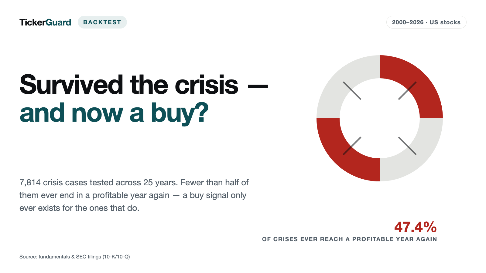
Before any return figure counts, a signal has to exist in the first place — and that is this study's actual central finding, not fine print at the end. Of 7,814 crises (loss streak of at least two years, ticker and episode counted once each), 3,706 (47.43%) ever reach a single profitable year again — the naive control arm R0. For the more demanding markers, the rate drops sharply: only 1,673 crises (21.41%) ever reach a double signal, the combination that actually beats the crisis cohort. And for 408 crises (5.22%), the stock leaves the exchange before any signal exists at all — these cases never appear in any of the return figures below, because there was nothing to buy.
| Arm | Signals (out of 7,814 crises) | Rate | Delisted before signal | Wait to signal (median) |
|---|---|---|---|---|
| R0 Naive — first profitable year after the crisis (control arm) | 3,706 (47.43%) | 47.43% | 5.22% | 2.00 years |
| R1 Cash flow ahead of earnings — operating cash flow positive, earnings still negative | 2,500 (31.99%) | 31.99% | 5.22% | 1.01 years |
| R2 Revenue accelerates (threshold +10%) | 3,223 (41.25%) | 41.25% | 5.22% | 2.00 years |
| R2 Revenue accelerates (threshold +20%, main variant) | 2,572 (32.92%) | 32.92% | 5.22% | 2.04 years |
| R2 Revenue accelerates (threshold +30%) | 2,133 (27.30%) | 27.30% | 5.22% | 2.92 years |
| R3 Deleveraging begins — without dilution | 1,957 (25.04%) | 25.04% | 2.28% | 1.02 years |
| R4 Double signal — at least two of R1/R2/R3 (main thesis) | 1,673 (21.41%) | 21.41% | 5.22% | 1.98 years |
The R3 arm (deleveraging) has a different denominator than the rest: where neither debt nor cash is documented, or where no net debt exists at all, deleveraging has not failed to appear — it simply cannot be checked. Of 7,814 crises, R3 is applicable to 3,336 at all; measured against that base, 1,957 (58.66%) reach a deleveraging signal — measured against all 7,814 crises it is only 25.04%.
The median wait for a first signal sits around two years for the naive arm R0, and just over a year for the cash-flow arm R1 — that arm reacts fastest, because operating cash flow often turns before the reported earnings figure does. The longest wait belongs to the revenue arm at its 30 percent threshold, at almost three years median; the double signal, at just under two years, is barely slower than the naive arm despite waiting for several markers to coincide.
The result: the double signal beats the cohort most clearly — but not alone
In the main segment "own strength" on a twelve-month fixed hold, six of the seven arms sit ahead of the crisis cohort, but by very different margins:
| Arm | Signals | Purchases | Positions (median) | Return p.a. | Crisis cohort p.a. | S&P 500 TR p.a. | Edge over cohort | Edge over S&P 500 |
|---|---|---|---|---|---|---|---|---|
| R0 Naive — first profitable year after the crisis (control arm) | 900 | 661 | 24 | 17.58% | 14.23% | 10.46% | +3.35 points | +7.12 points |
| R1 Cash flow ahead of earnings — operating cash flow positive, earnings still negative | 781 | 555 | 16 | 19.40% | 14.23% | 10.46% | +5.17 points | +8.94 points |
| R2 Revenue accelerates (threshold +10%) | 770 | 550 | 15 | 17.70% | 15.43% | 11.88% | +2.27 points | +5.82 points |
| R2 Revenue accelerates (threshold +20%, main variant) | 560 | 383 | 11 | 18.04% | 15.43% | 11.88% | +2.61 points | +6.16 points |
| R2 Revenue accelerates (threshold +30%) | 430 | 283 | 7 | 13.81% | 15.43% | 11.88% | −1.63 points | +1.93 points |
| R3 Deleveraging begins — without dilution | 923 | 692 | 19 | 17.69% | 14.23% | 10.46% | +3.46 points | +7.23 points |
| R4 Double signal — at least two of R1/R2/R3 (main thesis) | 585 | 440 | 12 | 20.23% | 14.23% | 10.46% | +6.00 points | +9.77 points |
The double signal (R4) holds the largest edge over the cohort at twelve months, +6.00 points — and it keeps that rank at every one of the four holding periods tested: +6.00 points at twelve months, +4.46 at 24, +3.16 at 36, and +6.90 points on a signal exit, each the highest figure of all seven arms at that holding period. The naive control arm R0 also stays ahead of the cohort throughout, but by a markedly smaller margin (+2.82 to +3.35 points). The three variants of the revenue arm (R2) show instead how quickly a signal loses power as its threshold rises — at a 30 percent revenue-acceleration requirement it no longer even beats the cohort at twelve and 36 months or on a signal exit.
| Holding period | Positions (median) | Return p.a. | Crisis cohort p.a. | S&P 500 TR p.a. | Edge over cohort | Edge over S&P 500 |
|---|---|---|---|---|---|---|
| 12 months | 12 | 20.23% | 14.23% | 10.46% | +6.00 points | +9.77 points |
| 24 months | 26 | 18.68% | 14.23% | 10.46% | +4.46 points | +8.22 points |
| 36 months | 37 | 17.39% | 14.23% | 10.46% | +3.16 points | +6.93 points |
| Signal exit (relapse) | 17 | 21.13% | 14.23% | 10.46% | +6.90 points | +10.67 points |
Across all four holding periods, the double signal remains the only rule with a consistently leading edge: 440 purchases out of 585 signals return 20.23% a year on a twelve-month hold, up to 21.13% on a signal exit — against the crisis cohort by +6.00 to +6.90 points, against the S&P 500 by +9.77 to +10.67 points.
It is not only THAT a signal fires, but HOW the company got there
The phoenix question runs into the same finding we already saw in the debt paydown turnaround study: a crisis company can improve its figures through genuine operating strength — or it can stay afloat by issuing fresh shares, while the figures look formally identical either way. We therefore separate a main segment "own strength" (share count stays within bounds) from a "diluted" recovery (share count grows by more than ten percent in the signal window) and never average across both. More than half of all clearly classified double signals — 740 of 1,325, or 55.85% — fall into the diluted segment; the main segment "own strength" with 585 signals is the minority.
| Segment | Holding period | Signals | Purchases | Return p.a. | Crisis cohort p.a. | Edge |
|---|---|---|---|---|---|---|
| Own strength (main segment) | 12 months | 585 | 440 | 20.23% | 14.23% | +6.00 points |
| Own strength (main segment) | 24 months | 585 | 440 | 18.68% | 14.23% | +4.46 points |
| Own strength (main segment) | 36 months | 585 | 440 | 17.39% | 14.23% | +3.16 points |
| Own strength (main segment) | Signal exit (relapse) | 585 | 440 | 21.13% | 14.23% | +6.90 points |
| Diluted (share count above +10%) | 12 months | 740 | 536 | 7.61% | 15.32% | −7.71 points |
| Diluted (share count above +10%) | 24 months | 740 | 536 | 11.33% | 15.32% | −3.98 points |
| Diluted (share count above +10%) | 36 months | 740 | 535 | 12.11% | 15.32% | −3.20 points |
| Diluted (share count above +10%) | Signal exit (relapse) | 740 | 536 | 10.61% | 15.32% | −4.70 points |
The gap is large and holds across all four holding periods: at twelve months the main segment returns 20.23% a year, the diluted segment just 7.61% — a gap of more than twelve points. At 24 months it is 18.68% against 11.33%, at 36 months 17.39% against 12.11%, on a signal exit 21.13% against 10.61%. The diluted recovery even sits at all four holding periods behind its own, freshly recomputed crisis cohort for that segment (15.32% at twelve months) — a double signal without a look at the share count is, in the diluted case, not a reliable buy rule but worse than buying blindly.
The size trap: the edge carries almost only above $100 million in revenue
Even within the main segment "own strength", the double-signal return is not a uniform finding across every company size. We split crisis companies by their pre-crisis revenue base into three classes — below $10 million, $10 to $100 million, above $100 million — and calculated separately:
| Revenue class | Signals | Purchases | Return p.a. | Crisis cohort p.a. | Edge |
|---|---|---|---|---|---|
| Revenue base below $10 million | 40 | 22 | −16.87% | 14.23% | −31.10 points |
| Revenue base $10 to $100 million | 95 | 68 | −3.37% | 10.49% | −13.86 points |
| Revenue base above $100 million | 448 | 349 | 20.20% | 15.32% | +4.88 points |
The picture is unambiguous: above $100 million in revenue, the double signal returns 20.20% a year — essentially the full headline figure of 20.23%, carried by 349 of the main segment's 440 purchases. Between $10 and $100 million the result flips to −3.37%, below $10 million to −16.87%. The two smaller classes also rest on a very thin base of just 68 and 22 purchases respectively — what holds here is mainly the direction, not the exact level. What remains is unambiguous all the same: this study's double-signal return is at its core a statement about larger crisis companies, not about the full range of written-off stocks. Smaller companies apparently less often have the operating and financial substance to turn a numerical recovery sign into an actual turnaround, and their thinner trading makes individual outliers overpowering.
Median against average: what the typical position actually returns
An average across single positions can be pulled upward by a handful of very large winners while the majority of positions return little or even lose money. The median shows instead what the middle, typical position actually achieved — and here the double signal separates itself even more clearly from the other six arms:
| Arm | Median (12 months) | Average (12 months) | Median (signal exit) | Average (signal exit) |
|---|---|---|---|---|
| R0 Naive — first profitable year after the crisis (control arm) | 2.12% | 15.96% | −7.98% | 43.99% |
| R1 Cash flow ahead of earnings — operating cash flow positive, earnings still negative | −0.20% | 16.46% | −3.20% | 28.91% |
| R2 Revenue accelerates (threshold +10%) | −0.20% | 10.07% | −7.81% | 137.76% |
| R2 Revenue accelerates (threshold +20%, main variant) | −0.20% | 11.52% | −11.11% | 175.22% |
| R2 Revenue accelerates (threshold +30%) | −4.68% | 6.23% | −15.18% | 145.43% |
| R3 Deleveraging begins — without dilution | −0.15% | 10.86% | −0.20% | 23.64% |
| R4 Double signal — at least two of R1/R2/R3 (main thesis) | 5.20% | 11.98% | 5.25% | 16.36% |
The gap is widest for the revenue arms (R2): on a signal exit the average reaches values above 140% while the median is simultaneously double-digit negative — a sign that a handful of extreme outliers (partly the short-fiscal-year artifacts described above) are distorting the picture. The double signal, by contrast, is the only one of the seven arms with a median that stays positive at all four holding periods: +5.20% at twelve months, +0.40% at 24, +1.98% at 36 and +5.25% on a signal exit. Even the naive control arm R0, which still shows a positive median at short and medium holding periods, flips to −7.98% on a signal exit. For the typical single position, the double signal was therefore, in this backtest, not only the most reliable of the seven rules tested on a portfolio average — it was also the most reliable for the individual purchase.
Sensitivities: what moves the result — and what does not
How robust is the double-signal finding against its own edge conditions? Six checks answer that.
Streak length. The longer the required loss streak before a crisis is established, the thinner and weaker the double-signal return becomes:
| Loss streak | Signals | Purchases | Return p.a. | Crisis cohort p.a. |
|---|---|---|---|---|
| 1 loss year | 1,219 | 924 | 17.72% | 13.86% |
| 2 loss years | 551 | 413 | 20.40% | 14.23% |
| 2 loss years or more (main cut) | 585 | 440 | 20.23% | 14.23% |
| 3 loss years | 226 | 176 | 11.79% | 9.75% |
| 5 loss years | 59 | 44 | −4.47% | 8.70% |
| 7 loss years | 19 | 12 | −4.40% | 8.33% |
At a single loss year (n1) and at two years (n2, n2plus), the double signal stays clearly ahead of its own, freshly recomputed cohort. From five loss years onward the picture flips to a negative return — but on a very thin base of just 44 and 12 purchases respectively, hardly enough to still count as a statement about a rule. The study's main cut (streak of at least two years) sits in the solid, broad part of this series, not at its thin edge.
Excluding Covid entries 2020 to 2022. Excluding purchases from the Covid window, the double-signal return in the main segment falls slightly from 20.23% to 17.37% (twelve months) and from 21.13% to 19.84% (signal exit) — the edge over the cohort stays intact at +3.14 and +5.61 points respectively. The pandemic years pulled the headline figure up somewhat but do not carry the entire finding.
Robustness arm, price quality. A stricter price check that only allows stocks with a more robust, gap-free price series cuts the purchase count in the main segment from 440 to 160 — more than half of the previous purchases fall out, while the signal count of 585 stays unchanged. The return drops only moderately, from 20.23% to 16.49% (twelve months) and from 21.13% to 17.90% (signal exit); the edge over the cohort stays positive at +2.26 and +3.68 points. Part of the headline figure therefore rests on stocks with thinner price quality, but not its entire edge.
R2 thresholds (revenue arm). How sharply does the revenue arm react to its own threshold? In the main segment at twelve months:
| Threshold | Signals | Purchases | Return p.a. | Crisis cohort p.a. | Edge |
|---|---|---|---|---|---|
| R2 Revenue accelerates (threshold +10%) | 770 | 550 | 17.70% | 15.43% | +2.27 points |
| R2 Revenue accelerates (threshold +20%, main variant) | 560 | 383 | 18.04% | 15.43% | +2.61 points |
| R2 Revenue accelerates (threshold +30%) | 430 | 283 | 13.81% | 15.43% | −1.63 points |
At ten and 20 percent required revenue acceleration, the arm sits roughly two to two-and-a-half points ahead of the cohort; at 30 percent it slips just behind. The revenue arm stays clearly behind the double signal in every variant — a sign that revenue acceleration alone, without confirmation from cash flow or deleveraging, is a weaker signal.
Signal exit against fixed holding periods. For the double signal, exiting on signal (a relapse into crisis) is, at 21.13% and a +6.90-point edge, the strongest of the four holding periods, just ahead of a fixed twelve-month hold. Holding fixed for 24 or 36 months instead gives back part of the edge (+4.46 and +3.16 points respectively) — a sign that part of the recovery happens early in the holding period, and a rigid fixed hold dilutes that effect.
Total-loss floor. Selling every position that vanishes during the holding period at a total loss instead of its last traded price drops the double-signal return in the main segment from 20.23% to 17.20% (twelve months) and from 21.13% to 17.90% (signal exit). That is a lower bound, not a second, equally weighted answer — as the delisting research below shows, a takeover is at least as common as a bankruptcy.
The following overview sets the main calculation against these counter-checks:
| Calculation | Signals | Purchases (12 months) | Return p.a. (12 months) | Return p.a. (signal exit) | Edge over cohort (12 months) |
|---|---|---|---|---|---|
| Headline calculation | 585 | 440 | 20.23% | 21.13% | +6.00 points |
| Excluding Covid entries 2020–2022 | 443 | 322 | 17.37% | 19.84% | +3.14 points |
| Robustness arm, price quality (stricter price check) | 585 | 160 | 16.49% | 17.90% | +2.26 points |
| Every delisting as a total loss (floor) | 585 | 440 | 17.20% | 17.90% | +7.18 points |
Counter-check: the balance-sheet traffic light at purchase — and why no buy rule comes out of it
Up to here this study only asks WHICH numerical event triggers the re-entry. An obvious follow-up question remains open: would an additional look at the state of the balance sheet in the purchase month have improved the result? We colour-coded every purchase in this study with our balance-sheet traffic light after the fact — using only the reported figures that were already published in the purchase month. Buying happens at month end; what counts is the traffic-light row of exactly that month, because it rests on the same set of accounts as the signal itself.
What the traffic light actually measures. Not whether a company is growing — whether it survives the next year. Red means at least one survival concern is documented: negative equity, an operating profit that does not even cover the interest bill, a cash position that lasts less than four quarters at the current burn rate, or two reported profitable years in which money nevertheless flowed out on balance. Green requires the opposite, every criterion documented: positive equity, net cash or interest cover of at least three, positive operating cash flow, net profit in both of the two most recent years, and cash for at least eight quarters. Yellow in between is not a fallback grade but a statement of its own: nothing documented for, nothing documented against. A missing figure never produces red and never produces green.
Composition first, returns second. Before any return comparison counts, it has to be clear how the purchases split across the four categories at all — what is counted here is purchases, not signals:
| Arm | Purchases total | Red | Yellow | Green | No traffic-light row |
|---|---|---|---|---|---|
| R0 Naive (control arm) | 661 | 200 (30.26%) | 429 (64.90%) | 1 (0.15%) | 31 (4.69%) |
| R1 Cash flow ahead of earnings | 555 | 402 (72.43%) | 112 (20.18%) | 0 (0.00%) | 41 (7.39%) |
| R2 Revenue +10% | 550 | 285 (51.82%) | 187 (34.00%) | 62 (11.27%) | 16 (2.91%) |
| R2 Revenue +20% | 383 | 204 (53.26%) | 121 (31.59%) | 45 (11.75%) | 13 (3.39%) |
| R2 Revenue +30% | 283 | 154 (54.42%) | 89 (31.45%) | 30 (10.60%) | 10 (3.53%) |
| R3 Deleveraging | 692 | 372 (53.76%) | 234 (33.82%) | 27 (3.90%) | 59 (8.53%) |
| R4 Double signal | 440 | 273 (62.05%) | 117 (26.59%) | 32 (7.27%) | 18 (4.09%) |
Green is practically unreachable for a crisis company: in the naive arm R0, exactly 1 of 661 purchases carries a green light; in cash-flow arm R1, not a single one of 555. That is not a measurement error but the definition: a company still posting losses meets neither "profit in both of the two most recent years" nor interest cover of three. For those two arms the traffic light is therefore not a three-colour filter at all, but a choice between red and yellow. Even in the double signal (R4) the majority is red: 273 of 440 purchases, or 62.05%.
And now the result you would not expect. The table below puts the unfiltered arm next to its four traffic-light cells, for the double signal (R4) and the naive control arm (R0), in both of the holding periods that carry:
| Arm | Holding period | Light at purchase | Signals | Purchases | Return p.a. | Crisis cohort p.a. | Edge over cohort | Gap to the whole arm |
|---|---|---|---|---|---|---|---|---|
| R4 Double signal | 12 months | No filter (whole arm) | 585 | 440 | 20.23% | 14.23% | +6.00 points | — |
| R4 Double signal | 12 months | Red | 316 | 273 | 24.24% | 14.23% | +10.01 points | +4.01 points |
| R4 Double signal | 12 months | Yellow | 125 | 117 | 0.66% | 15.32% | −14.66 points | −19.57 points |
| R4 Double signal | 12 months | Green | 33 | 32 | 1.34% | 10.91% | −9.57 points | −18.88 points |
| R4 Double signal | 12 months | No traffic-light row (thin) | 111 | 18 | −17.01% | 15.32% | −32.32 points | −37.23 points |
| R4 Double signal | Signal exit (relapse) | No filter (whole arm) | 585 | 440 | 21.13% | 14.23% | +6.90 points | — |
| R4 Double signal | Signal exit (relapse) | Red | 316 | 273 | 21.66% | 14.23% | +7.43 points | +0.53 points |
| R4 Double signal | Signal exit (relapse) | Yellow | 125 | 117 | 16.68% | 15.32% | +1.37 points | −4.45 points |
| R4 Double signal | Signal exit (relapse) | Green | 33 | 32 | 1.07% | 10.91% | −9.84 points | −20.06 points |
| R4 Double signal | Signal exit (relapse) | No traffic-light row (thin) | 111 | 18 | −18.28% | 15.32% | −33.60 points | −39.41 points |
| R0 Naive (control arm) | 12 months | No filter (whole arm) | 900 | 661 | 17.58% | 14.23% | +3.35 points | — |
| R0 Naive (control arm) | 12 months | Red | 242 | 200 | 21.65% | 14.23% | +7.42 points | +4.07 points |
| R0 Naive (control arm) | 12 months | Yellow | 481 | 429 | 13.35% | 15.55% | −2.19 points | −4.23 points |
| R0 Naive (control arm) | 12 months | Green (thin) | 1 | 1 | −62.04% | −13.07% | −48.97 points | −79.62 points |
| R0 Naive (control arm) | 12 months | No traffic-light row | 176 | 31 | −10.92% | 15.93% | −26.85 points | −28.50 points |
| R0 Naive (control arm) | Signal exit (relapse) | No filter (whole arm) | 900 | 661 | 17.05% | 14.23% | +2.83 points | — |
| R0 Naive (control arm) | Signal exit (relapse) | Red | 242 | 200 | 17.68% | 14.23% | +3.45 points | +0.62 points |
| R0 Naive (control arm) | Signal exit (relapse) | Yellow | 481 | 429 | 15.53% | 15.55% | −0.02 points | −1.52 points |
| R0 Naive (control arm) | Signal exit (relapse) | Green (thin) | 1 | 1 | −62.04% | −13.07% | −48.97 points | −79.09 points |
| R0 Naive (control arm) | Signal exit (relapse) | No traffic-light row | 176 | 31 | −5.47% | 15.93% | −21.40 points | −22.52 points |
For the double signal, the red light marks the strongest cell, not the weakest. Buying only the double signals with a red balance-sheet light in the main segment "own strength" and holding for twelve months returns 24.24% a year (273 purchases out of 316 signals) against 20.23% for the whole arm (440 purchases out of 585 signals) — a gap of +4.01 points. Cash-flow arm R1 shows the same thing: 24.70% on a red light against 19.40% for the whole arm. The deeper the balance-sheet distress at entry, the more ground there is to win back — provided the sign of life actually arrives.
It still does not become a buy rule, for three reasons. First, the sign flips for the revenue arms: across all segments, R2 at a ten percent threshold returns 16.00% a year on a green light (177 purchases) against just 8.15% on a red one (1,314 purchases) — same colour, opposite direction. Second, the edge melts once the holding period changes: on a signal exit the red double-signal cell returns 21.66% against 21.13% for the whole arm — +0.53 points instead of +4.01 points. Third, no single colour leads across all seven arms: in the main segment at twelve months, red leads in six of the seven arms, while green leads in the revenue arm at a ten percent threshold. A filter whose direction depends on the arm and on the holding period is not a filter but an after-the-fact observation.
One caveat that is bigger than it looks. The fourth category, "no traffic-light row", is not a poor balance-sheet grade. It only means that no scored balance-sheet row exists for that stock in that month — a question of data coverage, not a statement about the balance sheet. These purchases lose in every one of the seven arms in the main segment: in the double signal at −17.01% a year (on only 18 purchases — below 30, and therefore too thin a base for a rule), in the naive arm at −10.92% on 31 purchases. Where no scored set of accounts exists, it is almost always the smallest stocks in the universe — and it is exactly there that, as the size-trap chapter shows, the double signal itself fails to carry. The figure measures the gap in the data, not the quality of the balance sheet.
For the headline finding of this study the counter-check therefore changes nothing: the double signal remains the rule with the widest gap to the crisis cohort. An additional traffic-light condition would widen that gap noticeably in one holding period, barely at all in the other — and reverse it in other arms. We report the traffic light as a counter-check, not as part of the rule.
What happened to the stocks that vanished — BEFORE the first signal
408 crises (5.22% of all 7,814) end with the stock leaving the exchange before any signal exists at all — there is no buying opportunity here and therefore no return to gain or lose, but the question remains: do these companies vanish more often through takeover or through bankruptcy? We hand-researched a sample of 50 of the 408 cases (drawn by hash order, not a full census).
Of the 32 economically meaningful cases — purely technical events like renamings are counted separately, because the company simply kept operating there — 17 were takeovers (53.13%) and 15 were bankruptcies (46.88%), a narrow but slight lean toward takeovers. Extrapolated across all 50 sampled cases (including the technical and unclear ones) and backed by a 95% Wilson interval, the takeover share sits at 34.00% (range 22.44% to 47.85%, roughly 139 of 408 cases expected) and the bankruptcy share at 30.00% (range 19.10% to 43.75%, roughly 122 of 408 cases). The two intervals overlap substantially — unlike a successfully turned-around stock that later leaves the exchange, no clear direction is visible for crisis companies that never reach a signal at all. That is what justifies the separately reported total-loss floor for cases that vanish DURING the holding period AFTER a signal: the truth lies between the last traded price and a total loss, but not clearly closer to either edge.
What this study newly answers compared with our other balance-sheet signal studies
The phoenix finding does not stand in isolation — it confirms and extends three earlier backtests in our series, each on its own company universe and window that does not belong next to our figures directly, but does belong in the context. Our FCF inflection study shows for 2013 to 2026: a plain sign flip in free cash flow alone does not carry (9.61% against 15.02% for the S&P 500 with dividends in that study's own window) — only the acceleration of an already-positive series matters. Our debt paydown turnaround study shows for 2005 to 2026 exactly the same dilution finding this study delivers: it is not that debt falls that matters, it is how — 10.42% a year for genuine deleveraging against just 0.76% for a share-funded turnaround, in that study's own window and universe. And our crash-reversal backtest shows that a pure price capitulation without fundamental confirmation does not carry across the robust majority of exit variants tested and only turns positive in a very narrow, fragile window.
What this phoenix study newly answers is the fundamental side for companies whose crisis goes beyond a price-chart pattern: not a single balance-sheet signal, but the double signal of several numerical markers at once — and even that double signal, as shown above, carries almost only for larger companies and only when the turnaround was not bought with dilution. The three studies together draw a consistent picture: a single, isolated balance-sheet improvement is not a reliable buy signal. Only the combination of several markers — and a look at HOW a company got there — separates a signal that carries from one that only looks good on paper.
Honest limits of this calculation
A backtest is only as good as its fine print. This one has several limitations, selected from the 17 caveats of the underlying figures file:
- Price coverage of only a good third. Of the crisis companies in the comparison cohort, only 38.28% are bought at all — some are blocked over spliced price series, others have a price series that only begins after the entry month. The missing stocks skew toward the dead ones; both the portfolio and the comparison cohort are therefore biased somewhat TOO GOOD.
- Short fiscal years create artificial revenue jumps. Where a fiscal year is shortened — a spinoff, an IPO, a shifted balance-sheet date — reported revenue in the following year can grow by a multiple purely on paper, without anything happening in the business. This affects only the revenue arms (R2) and is one reason for the especially wide gap there between median and average.
- Estimated filing dates. For 38,560 of 122,122 usable company-years (31.6%), the actual filing date is unverified and estimated as balance-sheet date plus 90 days.
- Annual reports only. Quarterly figures are not part of this analysis — a turn therefore becomes visible only at the next annual report at the earliest, in practice often sooner. Industry classification is static and applied backward across all years.
- The window does not start in the year 2000. A crisis marker needs several fiscal years to establish, and a signal after that needs at least one more — the earliest buying opportunity is therefore only 2001 to 2003, depending on the arm. Figures from other studies in the series are therefore never placed next to ours, only cited with their own window label for context.
- Capital-intensive rental businesses trigger the K4 distress marker almost always, because their fleet or equipment purchases sit inside capital expenditure — their cash runway therefore always looks tight on paper. That is the commissioned calculation method, but it skews the cohort toward leasing and rental businesses.
- A position only contributes a monthly return if it traded in the previous month and in the current one. At small position counts (median as low as 1 to 20 stocks depending on segment and holding period), a single outlier can noticeably move the monthly average.
- No taxes, no trading spreads. Only 0.1 percent cost per side is modelled, nothing else.
- A backtest is not a forecast. This study is market research, not investment advice, and not a buy recommendation for any individual stock.
Conclusion
The phoenix thesis holds — but only in its most demanding form, and only for part of the crisis universe. Of 7,814 genuine crises, 47.43% ever reach a profitable year again, but only 21.41% ever reach a double signal of at least two numerical markers at once. Buying exactly that signal in the main segment "own strength" beats the crisis cohort more clearly, at every holding period tested, than any of the other six arms — at 20.23% a year on a twelve-month hold, up to 21.13% on a signal exit.
The most important caveat is not about the size of that number but about its reach: the edge carries almost exclusively above $100 million in revenue and collapses once the turnaround was bought with new shares rather than earned. A phoenix stock is therefore not a blanket buy signal for every written-off company — it is a signal for larger companies that leave their crisis behind on multiple numerical fronts at once, without diluting existing shareholders.
For how other balance-sheet signals fared in hindsight, read our debt paydown turnaround study, which confirms the same dilution finding for a different signal type; an overview of every rule we have back-tested is in our studies.
Frequently Asked Questions
A company with a loss streak of at least two years running that additionally shows at least one of four balance-sheet distress signals: negative operating cash flow, current assets below current liabilities, equity negative or down more than 30 percent within two years, or cash reserves covering less than four quarters at the current burn rate. The determination is point-in-time — only figures actually available at that moment count — and the share price plays no role in the definition on purpose. From 2001 to 2026, 7,814 cases (ticker and episode counted once each) meet this criterion.
The double signal (R4): at least two of three numerical markers — positive operating cash flow while earnings are still negative, accelerating revenue, or deleveraging beginning without dilution — must hold at the same time. In the main segment "own strength" it returns 20.23% a year on a twelve-month hold, up to 21.13% on a signal exit, and it holds the largest edge over the crisis cohort of all seven arms at every one of the four holding periods tested. The bare first profitable year (R0, the naive control arm) also beats the cohort at all four holding periods, but with a markedly smaller edge (+2.82 to +3.35 points depending on the holding period).
That is this study's central finding, not its fine print. Of 7,814 crises, 3,706 (47.43%) ever reach a profitable year again. Only 1,673 (21.41%) ever reach a double signal — the combination that actually beats the cohort. 408 crises (5.22%) leave the exchange before any signal exists at all — these cases never appear in any return figure, because there was nothing to buy. Every return figure in this study applies only to the minority of crises that DID produce a signal.
Above $100 million in revenue, the double signal returns 20.20% a year in the main segment (349 purchases out of 448 signals) — essentially the full headline figure of 20.23%. Between $10 and $100 million the result flips to −3.37% (68 purchases), below $10 million to −16.87% (just 22 purchases, an extremely thin base). Smaller crisis companies apparently less often have the operating and financial substance to turn a numerical recovery sign into an actual turnaround — or their thin trading makes single outliers overpowering. In this backtest, at any rate, the double signal did not carry for small companies — the edge in this study came almost entirely from the class above $100 million in revenue.
Because the double-signal markers — deleveraging in particular — also trigger when a company pays down debt not from its own operations but by issuing new shares. 740 of the 1,325 clearly classified signals (55.85%) fall into that diluted segment; there, the double signal returns just 7.61% a year on a twelve-month hold against 20.23% in the main segment "own strength" — a gap that also holds at 24 and 36 months and on a signal exit. Paying down debt with fresh shares dilutes existing shareholders; the balance sheet looks better, but each shareholder's stake in the company does not.
The average is pulled upward by a handful of very large winners — for the revenue arms (R2) it reaches over 140% on a signal exit while the median is simultaneously double-digit negative. The median shows what the typical, middle position actually returned. In the main segment, the double signal is the only one of the seven arms with a positive median at all four holding periods (+0.40% to +5.25%) — every other arm's median dips negative at least once. For a buy rule the median matters more than the average: it describes what the majority of positions actually experienced, not the outcome of a handful of outliers.
The main calculation sells every vanished position at its last traded price. Treating every delisting as a total loss instead, as a conservative floor, drops the double-signal return in the main segment from 20.23% to 17.20% (12 months) and from 21.13% to 17.90% (signal exit) — a lower bound, not a second, equally weighted answer. For delistings BEFORE the first signal — 408 cases where no return figure is generated at all — we hand-researched a sample of 50: 17 takeovers, 15 bankruptcies, 12 purely technical events, 6 remained unclear. Extrapolated with a 95% Wilson interval, the takeover share sits at 34.00% (22.44% to 47.85%) and the bankruptcy share at 30.00% (19.10% to 43.75%) — the two intervals overlap substantially, so a crisis company here does not clearly vanish more often through takeover than through bankruptcy.
In hindsight yes — but in the surprising direction, and not reliably enough for a rule. We colour-coded every purchase in this study with the balance-sheet traffic light of its purchase month (red: at least one documented survival concern, such as negative equity or a cash runway below four quarters; green: all five all-clear criteria documented; yellow: nothing documented either way). For the double signal in the main segment "own strength", it is the RED cell that is strongest: 24.24% a year from 273 purchases out of 316 signals, against 20.23% for the whole arm (440 purchases out of 585 signals) — a gap of +4.01 points. It still does not become a buy rule: on a signal exit the same gap shrinks to +0.53 points (21.66% against 21.13%), the revenue arms flip the direction — across all segments, R2 at a ten percent threshold returns 16.00% a year on a green light (177 purchases) against just 8.15% on a red one (1,314 purchases) — and no single colour leads across all seven arms. Green is nearly unreachable for a crisis company anyway: in cash-flow arm R1, not one of 555 purchases carries a green light.
It places the phoenix finding in context rather than repeating it. Our FCF inflection study shows, for a different company universe (2013 to 2026), that a plain sign flip in free cash flow alone does not carry — only the acceleration of an already-positive series matters. Our debt paydown turnaround study shows, for 2005 to 2026, exactly the same dilution finding this study delivers: it is not that debt falls that matters, it is how — 10.42% a year for genuine deleveraging against just 0.76% for a share-funded turnaround, in that study's own window and universe. And our crash-reversal backtest shows that a pure price capitulation without fundamental confirmation does not carry across the robust majority of exit variants tested and only turns positive in a very narrow, fragile window. What this phoenix study newly answers is the fundamental side for companies whose crisis goes beyond a price chart pattern: not a single balance-sheet signal, but the double signal of several numerical markers at once — and even that double signal, as shown above, carries almost only for larger companies and only when the turnaround was not bought with dilution.