Inventory-Sales Gap Backtested: The Arch Beats the Warning Signal — Middle 13.44% Against the Extremes 6.91% and 9.10% per Year
When inventory grows faster than sales, that is a classic fundamental-analysis warning sign — documented in academic research since the 1990s. We tested it on US stocks since 2000: 67,241 scoreable company-years, sorted into ten deciles, each held for twelve months. The result is not a slope from good to bad, it is an arch. Both extremes underperform the middle — the strongest inventory drawdown (6.91% a year) as much as the strongest inventory build-up (9.10%). As a decile buy or sell signal in either direction, the gap is unusable. We additionally built it into our own 7-point growth recipe as a warning filter — and then took it back out, because it cost more than it protected.
 Thomas Mücke
Founder & Publisher
Thomas Mücke
Founder & Publisher
The question: is a growing inventory a warning sign?
"Inventory growing faster than sales" is one of the oldest warning signs in fundamental analysis. Lev and Thiagarajan distilled it from analyst reports as early as 1993, and Abarbanell and Bushee built it into their well-known fundamental-signal strategy. The idea is simple: if a company is stacking up more goods than it sells, that points to overproduction, weak demand, or clogged distribution channels — problems that only show up in earnings later.
Practitioner Thornton O'glove put it plainly in his influential book "Quality of Earnings" (1987):
"The best method I have ever discovered to predict future downwards earnings revisions by analysts is a careful analysis of accounts receivable and inventories."
We tested this signal as a standalone decile backtest: the inventory-sales gap, defined as percentage inventory growth minus percentage sales growth versus the prior year. The formation date is June 30 of every year from 2000 to 2025, held for twelve months through the end of the following June, bought at the first available monthly price after the cut-off. The portfolio starts at $100,000, equal-weighted, at 0.1% order cost per side. Delisted companies stay in the portfolio: they are force-sold at the last available price, and the proceeds sit in cash until the next formation.
To keep the gap from breaking on small denominators, only inventory-carrying companies count — those whose inventory made up at least 2% of total assets in both comparison years. Of 185,030 company-years, 67,241 remained scoreable (36.34%); 44,300 company-years (23.94%) fell out as not inventory-carrying, and a further 51,923 (28.06%) because a required balance-sheet line item was missing.
The result in four numbers
Is a growing inventory a warning sign for stock buyers — as a standalone buy signal or as a filter on an existing recipe? We tested the inventory-sales gap as a decile backtest (formation June 30, 2000 through 2025) and separately as a warning filter on our 7-point growth recipe (January 2000 through July 2026). Four numbers carry the result:
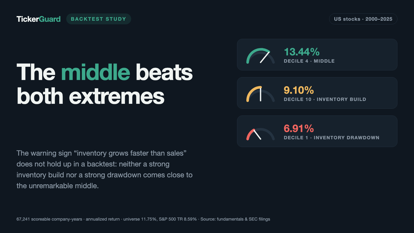
- 13.44% a year is what decile 4 returned — the strongest of the ten inventory-sales-gap groups sits in the middle of the ranking, not at either edge.
- 6.91% a year is what decile 1 (strongest inventory drawdown relative to sales) returned, decile 10 (strongest inventory build-up) returned 9.10% — both extremes stayed below the universe of all scoreable companies (11.75%); against the S&P 500 Total Return (8.59%), D1 came in below and D10 only barely above.
- 14.26% a year is what remained of the 7-point growth recipe once a warning filter blocked purchases with an inventory-sales gap in the worst tercile — barely less than the 14.38% without the filter.
- 16.18% per trade is what the 758 purchases blocked by the warning filter returned — more than the 13.51% of the purchases let through. The filter kept out above-average purchases, not below-average ones.
In the tested window, the inventory-sales gap delivered neither a slope as a decile signal nor protection as a warning filter that improved the purchases it let through.
The result: an arch, not a slope
If the inventory-sales gap were a clean warning signal, you would expect a slope: decile 1 (strongest inventory drawdown relative to sales) best, decile 10 (strongest inventory build-up) worst. That is not what the measurement shows.
| Decile | Return p.a. | Max drawdown | Median gap | Median revenue growth | Company-years |
|---|---|---|---|---|---|
| D1 (strongest inventory drawdown) | 6.91% | 66.59% | −64.06 pts | 50.16% | 5,619 |
| D2 | 11.03% | 55.16% | −26.13 pts | 14.28% | 5,607 |
| D3 | 12.77% | 54.00% | −14.17 pts | 9.06% | 5,606 |
| D4 | 13.44% | 53.15% | −7.38 pts | 6.09% | 5,607 |
| D5 | 13.33% | 50.23% | −2.35 pts | 4.97% | 5,598 |
| D6 | 11.49% | 52.98% | 1.87 pts | 3.54% | 5,612 |
| D7 | 11.98% | 55.62% | 6.88 pts | 2.92% | 5,607 |
| D8 | 12.44% | 53.08% | 13.59 pts | 2.67% | 5,606 |
| D9 | 12.20% | 54.44% | 26.58 pts | 1.37% | 5,607 |
| D10 (strongest inventory build-up) | 9.10% | 56.95% | 73.11 pts | 4.34% | 5,595 |
The ranking is an arch: both extremes — D1 at 6.91% and D10 at 9.10% a year — sit below the equal-weighted universe of all scoreable companies (11.75%); against the S&P 500 Total Return (8.59%), D1 sits below and D10 only barely above. The middle performed strongest: D4 at 13.44%, closely followed by D5 at 13.33% — deciles where inventory grew neither much faster nor much slower than sales.
| Run | Return p.a. | Max drawdown |
|---|---|---|
| All scoreable companies, equal-weighted | 11.75% | 54.40% |
| S&P 500 Total Return | 8.59% | 50.95% |
| Long-short D1 minus D10 (arithmetic, no borrow cost) | −2.24% | 65.05% |
The last row makes it clearest: anyone treating strong inventory drawdown long and strong inventory build-up short as a portfolio idea would have ended up at −2.24% a year — a pure calculation without borrow costs or margin calls, but it shows the gap does not reliably separate good stocks from bad ones here. As a decile buy or sell signal in either direction, it is unusable. What remains is a weaker but more honest message: avoid extreme inventory-sales gaps in either direction, without turning that into a timing signal.
Debunking decile 1: merger, not discipline
The intuitive conclusion is tempting: decile 1, the strongest inventory drawdown relative to sales, sounds like disciplined inventory management — lean stock, efficient companies. The numbers say otherwise. Median revenue in decile 1 grew 50.16%, while inventory barely kept pace — hence the extreme median gap of −64.06 percentage points. That is not an efficiency signal, it is the fingerprint of a merger or a hypergrowth phase: revenue at a newly combined or explosively growing company jumps in a single year, while inventory does not keep the same pace for accounting reasons (consolidation effects, service-revenue mix, base changes).
One example from the holdings makes this concrete: American Airlines reported 59.5% revenue growth in 2014 against a 0.8% inventory decline — a −60.3 point gap. The jump comes from the merger with US Airways completed in December 2013 — 2014 was the first full combined fiscal year — not from a suddenly leaner stockroom. Reading a quality message into the gap alone confuses an accounting effect with a management decision.
The warning-filter test: slowed down, not protected
A warning signal does not have to work as a standalone decile buy signal to be useful — it could also work as a filter on an existing buy recipe: block purchases when inventory is growing dangerously fast. That is exactly what we tested, on our own 7-point growth recipe from the study "Growth Gems" (buy at exactly seven of ten criteria met, sell as soon as the score leaves seven).
The filter rule: a purchase is skipped if a scoreable inventory gap exists and it falls in the worst tercile of the most recent formation. Companies without a scoreable metric — for example non-inventory-carrying service businesses — pass through unfiltered. The filter only affects purchases, never positions already held.
| Run | Return p.a. | Max drawdown | Purchases | Purchases with metric | Hit rate | Return per trade |
|---|---|---|---|---|---|---|
| E7 without filter (reference) | 14.38% | 53.08% | 7,942 | 37.67% | 56.96% | 13.77% |
| E7 with inventory warning filter | 14.26% | 51.97% | 7,374 | 32.26% | 57.05% | 13.34% |
The filter rejected 6,825 buy opportunities (616 stocks, counted as stock-months, not prevented purchases — the same stock counts again in each month it remains a candidate) and, of those, blocked 758 of the 7,942 purchases in the unfiltered reference run (9.5%). The return dropped only slightly as a result, from 14.38% to 14.26% a year — at first glance a small, plausible price for less risk.
The counter-test shows this price went the wrong way. We measured how the 758 blocked purchases actually performed in the unfiltered run — where they stand under identical conditions next to everything else:
| Group | Purchases | Closed | Return per trade | Hit rate | Months held |
|---|---|---|---|---|---|
| Let through | 7,184 | 6,884 | 13.51% | 57.22% | 11.40 |
| Blocked by filter | 758 | 741 | 16.18% | 54.52% | 12.17 |
The blocked purchases returned 16.18% per trade, better than the ones let through (13.51%) — at a somewhat lower hit rate (54.52% against 57.22%), but a clearly higher average return. The filter did not sort out the weaker purchases, on average it sorted out the better ones. A warning filter that blocks precisely the more profitable trades is not risk protection — it is a return drag with no offsetting benefit. We therefore discarded the filter and did not carry it into the live scanner.
Robustness checks: size and the delisting assumption
Two follow-up checks show how stable the arch shape is. Restricting the universe to companies above $100 million in revenue leaves the picture intact: the filtered universe returned 12.18% a year, decile 1 within it (re-deciled) 9.45%, decile 10 11.40% — again both extremes sit below the broader universe.
| Run | Description | Return p.a. | Max drawdown |
|---|---|---|---|
| Revenue filter | All companies above $100M revenue, equal-weighted | 12.18% | 54.20% |
| Revenue filter | D1, only companies above $100M revenue (re-deciled) | 9.45% | 56.02% |
| Revenue filter | D10, only companies above $100M revenue (re-deciled) | 11.40% | 55.40% |
| Total loss | D1, delisting as total loss instead of last price | 3.89% | 76.67% |
| Total loss | D10, delisting as total loss instead of last price | 5.91% | 65.60% |
The result reacts more sharply to the delisting assumption. In the headline run, a delisted company is force-sold at the last available price — a mild assumption, since many delistings are effectively total losses. Replacing that assumption with a genuine total loss drops decile 1 from 6.91% to 3.89% a year, and decile 10 from 9.10% to 5.91%. Both edge deciles carry noticeably more delisting risk than the middle: 42.30% of company-years in D1 were later delisted, 39.66% in D10 — against 31 to 35% in deciles D3 through D8.
Sub-periods: the effect lives almost only before 2013
Splitting the 26-year measurement window in half, the already-weak arch nearly disappears in the more recent period.
| Run | 2000–2012 | 2013–2026 |
|---|---|---|
| All scoreable companies | 14.99% | 8.87% |
| D1 (strongest inventory drawdown) | 12.57% | 1.97% |
| D4 (strongest middle) | 17.12% | 10.17% |
| D5 | 17.71% | 9.45% |
| D10 (strongest inventory build-up) | 11.64% | 6.83% |
| S&P 500 Total Return | 1.90% | 15.13% |
| Long-short D1 minus D10 | 0.71% | −4.88% |
In the first half (2000–2012), D1 still had a visible edge over D10 — 12.57% against 11.64% — and the long-short calculation was barely positive at 0.71%. In the second half (2013–2026), D1 collapses to 1.97% a year, clearly below D10's 6.83%, and the long-short calculation falls to −4.88%. This matches academic expectations: whatever predictive power this signal retained sat mostly in the first half of the sample, closer to the end of the original studies.
Context: what the research says about this signal
The inventory-sales signal (usually labelled INV in the literature) traces back to Lev and Thiagarajan (1993), who distilled it from analyst reports. Abarbanell and Bushee built it into their fundamental-signal strategy in 1997 and showed in 1998, on NYSE/AMEX data from 1974 to 1988, that INV alone delivered around 3.8% size-adjusted abnormal return per year (coefficient 0.038, t-statistic 2.37 over 12 months) — one of only a few individually statistically significant signals in their nine-signal strategy.
A related but differently constructed variant was studied by Thomas and Zhang (2002): they scaled the raw inventory change by average total assets (with no revenue reference at all) and found, on NYSE/AMEX data from 1970 to 1997, a hedge return of 11.4% a year between the top and bottom decile, positive in 27 of 28 years studied. Their central finding was:
"We find that the negative relation between accruals and future abnormal returns documented by Sloan (1996) is due mainly to inventory changes."
Both core papers predate our 2000 start year — our backtest measures almost exclusively post-publication years. That matters, because research has since established that published anomalies weaken after publication. McLean and Pontiff (2016) examined 97 published return predictors and found their returns declined by an average of 58% after publication. Green, Hand and Soliman (2011) showed that the closely related accrual anomaly — whose main driver, per Thomas/Zhang, is inventory — has decayed to no longer reliably positive hedge returns in the US. Our measurement starting in 2000 is therefore not a refutation of the original papers, but rather a confirmation of them: an effect that had already passed its publication half-life.
Our house variant also differs from the originals in several respects: we use a simple prior-year base instead of the two-year average in Abarbanell/Bushee, total inventory instead of finished goods, no size adjustment, and our own 2% minimum inventory-to-assets ratio, which appears in none of the cited sources. These deviations make our backtest a house variant, not a replication — one more reason to read the result for what it is: a standalone, honest test, not a reconstruction of the original studies.
How we calculated this
- Universe and period. US stocks, formation on June 30 of each year from 2000 through 2025, held through the end of the following June. 185,030 company-years total, of which 67,241 were scoreable (36.34%).
- Inventory-carrying filter. Only companies whose inventory made up at least 2% of total assets in both comparison years — our own addition against the small-denominator problem, not specified this way in any cited source.
- Portfolio. Equal-weighted, starting capital $100,000, 0.1% cost per side, bought at the first monthly price after the cut-off. Maximum age of the financial statement used: 18 months.
- Delisting. Vanished stocks stay in the portfolio and are force-sold at the last available price; proceeds sit in cash until the next formation. That is the milder assumption — see the total-loss robustness check above.
- Warning-filter run (E7). Runs separately on the 7-point growth recipe, January 2000 through July 2026. Golden-master reconciliation confirmed: the unfiltered reference run is identical to the independent baseline run of the growth recipe (same trade list, same NAV series, same ending value).
Sources. Balance-sheet and income-statement data plus monthly prices from our own fundamentals holdings; academic context from the cited original papers (Lev/Thiagarajan 1993, Abarbanell/Bushee 1997/1998, Thomas/Zhang 2002) and the post-publication studies by McLean/Pontiff (2016) and Green/Hand/Soliman (2011).
What this study does not say
- The max drawdown is the mildest reading. It is based on month-end values; a true intra-month maximum drawdown runs deeper.
- The long-short figure is a calculation, not a portfolio. It includes neither borrow costs on the short leg nor margin calls.
- The warning filter only affects purchases. A stock already held is never sold because of its inventory.
- Delisting coverage is uneven across the edge deciles. The splice rate (company-years where a statement had to be carried forward past the age limit) sits at 20.16% in D1 and 19.89% in D10 — against 7 to 12% in deciles D3 through D9. The edge deciles are therefore less well backed by data than the middle.
- No taxes, no bid-ask spread, no market impact. Every portfolio series includes only the 0.1% order cost per side.
- A pure post-publication measurement. Both core academic papers on this signal predate our 2000 start year; our finding is therefore not a test of the original studies, but a question of whether the signal still holds today.
- A backtest is not a forecast. This study is market research, not investment advice and not a buy recommendation.
Conclusion: no new tool, an honest negative result
Unlike other backtests, we are not building a standalone live scanner from the inventory-sales gap. As a decile buy signal it produces an arch rather than a slope — both extremes underperform the middle, and the obvious long-short bet even lost money. Applied as a warning filter to our backtested 7-point growth recipe, it slowed returns slightly while blocking above-average purchases. What remains of the classic warning "inventory grows faster than sales" is a weak message visible only at the extremes — not a timing tool, but at most a reason to look more closely at unusually sharp inventory moves before turning them into a buy or sell decision.
Frequently Asked Questions
The difference between percentage inventory growth and percentage sales growth versus the prior year, measured as of June 30. A positive value means inventory grew faster than sales — the classic fundamental-analysis warning sign. We sort all scoreable companies into ten deciles by this gap and hold each decile portfolio for twelve months, equal-weighted, at 0.1% cost per side.
Not as a simple decile signal in our measurement. Decile 10 (strongest inventory build-up) returned 9.10% a year, below the universe (11.75%), but decile 1 (strongest inventory drawdown) did even worse at 6.91%. Both extremes underperformed the middle — an arch, not a slope. Only "avoid both extremes" survives as a message.
Because the most extreme negative gap is usually not a sign of efficiency, it is a sign of mergers or hypergrowth: median revenue growth in decile 1 was 50.16% while inventory barely kept pace. One example: American Airlines in 2014, revenue up 59.5%, inventory almost unchanged — the gap comes from an explosion, not discipline.
We applied it to our 7-point growth recipe, blocking purchases whenever inventory had built up sharply. The return dropped only slightly, from 14.38% to 14.26% a year, even though 758 of 7,942 purchases (9.5%) were removed. Worse, the blocked purchases returned 16.18% per trade, above the 13.51% average. The filter hurt more than it helped — we discarded it.
The signal (INV) traces back to Lev/Thiagarajan (1993) and was documented by Abarbanell/Bushee (1998, 1974–1988) at around 3.8% abnormal return per year; Thomas/Zhang (2002, 1970–1997) found 11.4% hedge return for a related, asset-scaled variant. Our sample starts in 2000 — almost purely post-publication. That matches McLean/Pontiff (2016): published anomalies lose an average of 58% of their return after publication.
It is a calculation, not a tradeable portfolio — no borrow costs, no margin calls on the short leg. It came in negative, at −2.24% a year. That further confirms the gap does not provide a reliable buy-sell axis in decile form.
A purchase in the 7-point recipe was skipped if a scoreable inventory gap existed and it fell in the worst tercile of the most recent formation. Companies without a scoreable metric passed through unfiltered. The filter only affected purchases, never positions already held — a stock was never sold because of its inventory.
No. Unlike other backtests, we are not building a standalone tool from the inventory-sales gap, because it delivers no usable buy or sell rule as a decile signal and, as a warning filter, measurably hurt the existing growth recipe. The honest finding here is a negative result.