The Green Line Breakout Backtest: 31,752 All-Time-High Breakouts Since 1962
Dr. Eric Wish publishes his "Green Line Breakout" on the Wishing Wealth Blog: a horizontal green line drawn on the monthly chart at a stock's last untouched all-time high — once a stock breaks out above it, his own logic goes, no one is left holding a loss above that price. We translated his publicly described rules into a measurable recipe and backtested it across the entire US stock market since 1962, survivorship-free, including every stock later delisted: 31,752 breakouts, 31,220 completed trades, 6,159 tickers. The verdict cuts both ways. The entry signal carries real information — but Wish's own stop-loss recipe, the tight sell rule under the green line, fails in practice and trails the broad market. An update dated 8 August 2026 shows the other half of the finding: swap that one sell rule for patient holding, and the same rule beats the market in the backtest — with caveats the article names openly.
 Thomas Mücke
Founder & Publisher
Thomas Mücke
Founder & Publisher
Dr. Eric Wish publishes a market indicator and his own chart examples daily on the Wishing Wealth Blog. His best-known concept is the "Green Line Breakout" (GLB): a horizontal green line drawn on a stock's monthly chart at its last untouched all-time high. His reasoning is simple and intuitive — above a genuine all-time high, nobody can still be sitting on a loss, so there is "no overhead supply" left. The concept has circulated in trading communities for years, usually as a loose approximation. What has not been publicly available is a clean, survivorship-free backtest across the entire US stock market, not just the examples Wish himself shows on his blog.
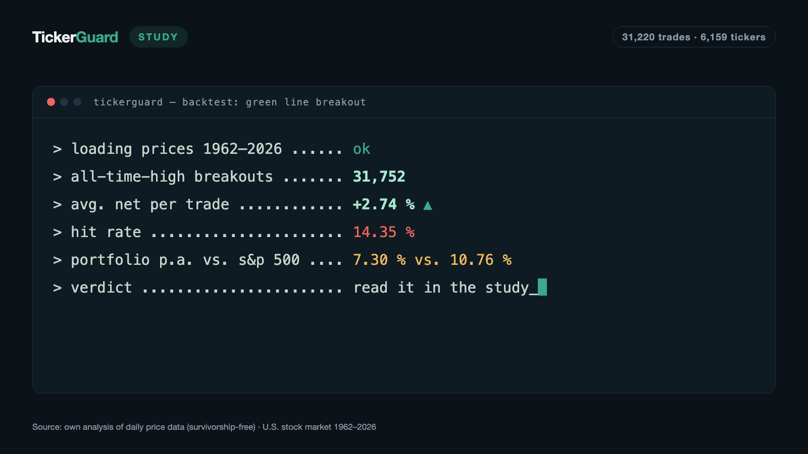
We built exactly that. We translated his own publicly available rules into a measurable recipe and backtested it across the full US stock market since 1962 — including every company that no longer trades today. The result: 31,752 breakouts, 31,220 completed trades, an average return of +2.74% per trade after costs. But the finding has a clear fault line: the signal itself carries real information — Wish's own stop-loss recipe, the tight sell rule under the green line, fails in practice, and even the surviving version of that recipe does not beat the broad market. In an update dated 8 August 2026 we ran the counter-test: swap that one sell rule for patient holding, and the same rule does beat the market — with caveats set out further below.
The result in four numbers
Does Dr. Eric Wish's "Green Line Breakout" actually work, or does it fail on its own sell rule? We tested the signal and the original recipe separately, then ran a counter-test with a different exit rule. Four numbers carry the result:
- 7.30% per year is what the original recipe (tight line stop, as Wish describes it) returned in the portfolio simulation since 1993.
- 10.76% per year is what the SPY index (total return) returned over the same window — the original recipe trailed it.
- +2.74% per trade after costs is what the entry signal returned in the main run, well above two random baselines with an identical trade count (+0.11% and +1.49%) — the signal itself carried real information.
- 12.79% per year is what the combined portfolio reached in the update of 8 August 2026 (same entry, but patient holding instead of the line stop) — 2.03 percentage points ahead of the SPY. The rule, though, was derived from the same sample in which it is measured, and a calendar-matched random baseline already returned +5.29% per trade.
In the tested window, the entry signal carried real information while Wish's own stop-loss recipe did not beat the market — only swapping the sell rule flipped the picture, with the caveats named above.
Who is Dr. Eric Wish
Eric Wish is a research psychologist by training: an associate professor emeritus in the University of Maryland's Department of Criminology and Criminal Justice, director of the university's Center for Substance Abuse Research from 1990 to 2022, and today head of his college's Center for Financial Literacy Education. The stock market is his second passion — since 2006 he has given courses on the stock market and technical analysis at the same university, and he runs the Wishing Wealth Blog, publishing his self-developed GMI market indicator, his own trades, and chart examples daily. His readers know him simply as "Dr. Wish." Unlike many other momentum educators, his approach leans less on a single spectacular result and more on a handful of recurring, clearly stated rules — of which the Green Line Breakout is the best known.
The same caveat applies to Wish as to any self-published, self-documented trading concept: his track record is self-reported, documented through blog examples rather than independently audited. This study therefore tests only the rule, not his personal trading results.
What we tested: turning a blog definition into a measurable rule
Wish's own definition of the green line is precise enough to carry over almost verbatim:
"I draw a green line on a monthly stock chart at a bar at an all-time high that has not been penetrated (or closed above) for three straight months (or 3 bars)."
— Wishing Wealth Blog glossary, Dr. Eric Wish (wishingwealthblog.com)
From this and related statements we built a complete, testable recipe: the line forms at the highest monthly high since the start of the data, unbroken for the following three full calendar months; it only becomes valid on the first trading day of the fourth following month — anything earlier would be a look ahead a real trader would not have had at the time. The buy triggers on the first daily close above that line. Wish also notes that it helps if a stock has "already doubled from its lowest price over the past year" before the breakout — we ran that as a separate sensitivity, covered below.
On the exit side, Wish is equally explicit — and this is the crux of this study:
"I have a strict rule to sell a stock immediately if it comes back below its green line."
"…until it closes below its rising 30 week average."
— Wishing Wealth Blog, Dr. Eric Wish
Those two sentences are the entire original exit rule: a tight stop under the line, and — as long as price holds above the line — a hold until the 30-week average breaks. We carried both over literally, with two deliberately conservative refinements. First, the moving-average exit fires on the first weekly close below the 30-week average of weekly closes. Second, we did not model the word "rising" attached to that average, because it is not a testable number but a judgment call — dropping it is the stricter, earlier-selling reading. Every one of these translation decisions, with its source quote, is documented individually in our full rule documentation.
One piece of Wish's system we could not rebuild: his GMI market filter, which only allows buys when the overall market backdrop looks favorable. Wish has publicly named the six components that feed the GMI — but he has deliberately left the exact calculation of three of them undisclosed. We approximated the filter with a classic, publicly documented proxy instead and reported it as its own separate sensitivity — details below.
Setup: survivorship-free across 64 years
The main run covers the entire US stock market from 1962 through 2026, explicitly including every company that has since been delisted — otherwise the study would only measure the survivors and quietly flatter the result. The scan found 31,752 valid breakouts, of which 31,220 became fully completed trades across 6,159 distinct tickers, spanning 14 September 1962 through 5 August 2026. Cost assumption: 0.2% per leg, so on both entry and exit.
Before the results, a word on how these numbers were checked. An automated lookahead test confirms, for all 31,752 signals, that no line was ever used before its own valid date. A recall check against known anchor examples straight from the Wishing Wealth Blog — SHAK's breakout in August 2019 and TRIP's in March 2013 — finds both at exactly the reported time. Checking a further set of five blog examples from May 2021, three of five were found in the price data (the other two are simply missing as price files in our data set, not a rule mismatch). A sample of ten randomly drawn trades was recalculated step by step, one at a time — all ten match the automated computation to the percentage point. Verdict of the entire check sequence: every check passed.
The result: the signal carries information
| Metric | Value |
|---|---|
| Signals | 31,752 |
| Trades (main run) | 31,220 |
| Tickers | 6,159 |
| Hit rate | 14.35% |
| Avg. return per trade (after costs) | +2.74% |
| Median per trade | −2.19% |
| Avg. holding period | 35.8 trading days (median 4) |
| Avg. win | +42.47% |
| Avg. loss | −3.92% |
At first glance, a 14.35% hit rate looks disappointingly low. Measured against chance, though, the signal carries real information: two independent random baselines with the exact same trade count — one drawn entirely freely across all trading days, one matched to the same calendar year as the real signal — return only +0.11% and +1.49% per trade. The gap to the actual strategy is therefore 2.6 and 1.2 percentage points per trade respectively. The most extreme individual trades across the whole run also show how wide the distribution is: HAS returned +6,743.9% across 910 trading days between 1982 and 1985, JCI +3,425.9% between 1985 and 1987 — both exited on the 30-week average, neither on the tight line stop.
Why the original stop fails: too tight, too soon
This is where the second, decisive finding sits. Wish's own stop rule — sell immediately once price falls below the green line — determines how most trades actually end:
| Exit reason | Trades | Share | Avg. return |
|---|---|---|---|
| Line stop (price falls back below the line) | 26,313 | 84.3% | −3.9% |
| Weekly close below the 30-week average | 4,313 | 13.8% | +38.8% |
| End of price series (position still open) | 488 | 1.6% | +30.5% |
| Data-series break | 106 | 0.3% | +59.5% |
84.3% of all trades exit on the line stop — at an average loss of −3.9%. That is the original rule doing exactly what it is designed to do: small, consistently capped losses, precisely as Wish describes it. The problem is not the rule itself, but how often it fires: four times out of five, a breakout falls back below the line after a median of just three trading days, before there is any way to know whether it would have turned into a larger trend.
The positive result of the strategy comes from the remaining 13.8% of trades that survive that early stop and are instead sold on the first weekly close below the 30-week average — averaging +38.8%. Without that group, the sum across all trades would be clearly negative. That is a classic trend-following distribution: many small, correctly capped losers, a few very large winners that carry the whole result. But that is also exactly the practical problem for anyone trying to trade this rule: the tight stop does not just filter out the "wrong" breakouts — it also cuts off a portion of the potential large trends before they have a chance to prove themselves.
What happens without the stop: the signal's real ceiling
To see how much power sits in the entry signal itself, independent of the stop-loss recipe, we reran the same 31,752 breakouts with a fixed holding period and no stop at all:
| Holding period | Trades | Hit rate | Avg. return | Median |
|---|---|---|---|---|
| 21 trading days (~1 month) | 31,729 | 51.9% | +1.18% | +0.30% |
| 63 trading days (~3 months) | 31,678 | 56.5% | +3.87% | +1.96% |
| 126 trading days (~6 months) | 29,317 | 58.0% | +7.29% | +3.63% |
| 252 trading days (~12 months) | 23,764 | 60.4% | +14.59% | +7.10% |
The picture flips entirely. With no stop at all, the hit rate climbs steadily with the holding period, from 51.9% to 60.4%, and the median turns positive. At 12 months, the average trade returns +14.59% at a 60.4% hit rate — more than five times the main run's +2.74% expectancy. The implication is hard to miss: a breakout above a genuine all-time high is, on median, a good signal — but the original's tight line stop destroys a substantial share of that value by selling most trades before they had time to develop.
The portfolio simulation: does the recipe beat the market?
Raw trade statistics say nothing about what an account with limited capital would actually have earned. We simulated: starting capital $100,000, at most 20 open positions at 5% each, following the original recipe exactly, including the tight line stop.
| Period | Trades taken | Ending capital | CAGR |
|---|---|---|---|
| Since 1993 (SPY comparison window, 33.6 years) | 4,453 of 27,394 offered | $1,064,465 | 7.30% |
| SPY buy-and-hold, same window (total return) | — | — (total +2,964%) | 10.76% |
That is the number that matters: in the directly comparable window since 1993, the GLB portfolio returns 7.30% a year — 3.46 percentage points behind the SPY's 10.76%. The original recipe with a tight stop does not beat the market. Over the full data span since 1962 (63.9 years), the same portfolio math produces a higher CAGR of 9.64% and an ending capital of $35,861,348 — but that longer run is not directly comparable to the SPY figure, because the SPY series itself only starts in 1993, so the two numbers measure different windows.
As an additional yardstick, we calculated an equal-weighted stock universe — the median annual return across every ticker traded in the data set, with no selection rule at all. Across the full 1962-2026 span, the median of these yearly medians comes to roughly 7.15% a year — similar to the GLB portfolio itself, well below the SPY. The simple average would be misleading here, since individual ticker-years (after sharp price spikes) can exceed +1,000% and skew the mean; hence the median. 2008 (−47.5%) and 2022 (−27.6%) were among the weakest years, 2003 (+39.5%) and 1975 (+34.6%) among the strongest.
Across the decades: an edge that keeps fading
| Decade | Trades | Hit rate | Avg. per trade |
|---|---|---|---|
| 1960s (from 1962) | 109 | 11.9% | +2.48% |
| 1970s | 336 | 12.8% | −0.25% |
| 1980s | 2,368 | 18.9% | +9.78% |
| 1990s | 5,130 | 15.1% | +5.58% |
| 2000s | 8,221 | 13.7% | +1.59% |
| 2010s | 9,076 | 14.3% | +1.33% |
| 2020s | 5,980 | 13.0% | +1.39% |
The strategy was markedly more powerful in the 1980s and 1990s than it is today: an average of +9.78% and +5.58% per trade, respectively. Since the 2000s, the average has settled into a narrow band of just +1.33% to +1.59% — roughly a seventh of the 1980s level and a little over a quarter of the 1990s level. A plausible reason is not hard to find: the better known and the more algorithmically traded a market becomes, the faster easily spotted patterns like an all-time-high breakout get anticipated or arbitraged away by other participants. The 1970s stand out as the only decade with a slightly negative average — plausibly explained by the oil shocks and inflation crises of that decade, which sent many all-time-high breakouts straight into sharp reversals.
The GMI market filter: named, but impossible to reproduce
Wish's rule does not run without a filter in practice: by his own account, he prefers to buy breakouts when his GMI market indicator signals a favorable overall market backdrop. Wish listed the six components the GMI counts in his blog post "About the General Market Index (GMI)" of April 2005 — among them his own ten-day index of successful new highs, the daily count of new highs in the market, his own trend indexes on QQQ and SPY, and a mutual-fund index from a paid industry publication. What he has deliberately left undisclosed is how three of those components are calculated, which makes the GMI impossible to reproduce for an independent backtest. That is not a minor omission: a working market filter could, in theory, filter out exactly the weak stretches where the tight line stop fires most often.
We therefore tested a classic, publicly known proxy with the same function, explicitly not as a rebuild of the GMI but as a stand-in: only accept a signal when last month's SPY close sits above the 10-month moving average of SPY's own monthly closes — a simple, widely used long-term trend filter.
| Variant | Trades | Hit rate | Avg. return |
|---|---|---|---|
| Main run (no market filter) | 31,220 | 14.35% | +2.74% |
| GMI proxy (SPY prior month above SMA10) | 23,172 | 14.1% | +2.17% |
The result is a letdown for the filter idea: the proxy cuts the trade count by roughly a quarter while slightly worsening the expectancy (+2.17% instead of +2.74%). Whether Wish's actual GMI performs better cannot be checked with public data — but the proxy tested here does not improve the results.
Further sensitivities at a glance
Beyond holding period, exit reason, and market filter, we ran seven additional variants of the recipe to check how stable the core finding is against different assumptions:
| Variant | Trades | Hit rate | Avg. return | Median |
|---|---|---|---|---|
| Main run (reference) | 31,220 | 14.35% | +2.74% | −2.19% |
| Line stop only, forced exit after 252 days | 30,614 | 10.7% | +2.88% | −2.35% |
| Buy only on month-end confirmation | 20,296 | 26.1% | +5.43% | −3.08% |
| Breakout volume ≥ 1.5x the 50-day average | 15,652 | 17.6% | +3.58% | −2.88% |
| "Doublers" only (price ≥ 2x the 252-day low) | 8,098 | 15.6% | +4.55% | −3.87% |
| Median dollar volume ≥ $3M over 20 days | 19,503 | 13.6% | +1.83% | −2.00% |
| Excluding tickers with truncated history (see below) | 30,514 | 14.4% | +2.76% | −2.21% |
| Delisting as total loss (−100%) instead of last price | 31,220 | 13.0% | +0.72% | −2.27% |
| Random, uniformly distributed days | 31,220 | 42.8% | +0.11% | −0.40% |
| Random, calendar-matched distribution | 31,220 | 44.7% | +1.49% | −0.40% |
Two rows stand out. First, the doubler filter: Wish notes it helps when a stock has already doubled from its lowest price of the past year before breaking out — and indeed, these 8,098 trades come in at a clearly higher average return of +4.55%. Second, volume confirmation: Wish's own hint that "it does help if the stock showed above average volume…" also holds up, +3.58% instead of +2.74%, though on only half as many trades (15,652 instead of 31,220). Both add-on filters cost trade count while improving average returns — a sign that the original recipe can be tightened using quality filters Wish himself mentions, even though they are deliberately left off in the main run.
The delisting sensitivity deserves its own note. Booking every delisted stock out at a total loss of −100% instead of the last available price drops the expectancy to +0.72% per trade — still positive, but noticeably closer to the random baselines. Part of the measured edge therefore depends on the assumption of how much a delisting actually costs; in reality the truth usually sits somewhere between "last price" and "total loss," depending on whether and how an investor could still sell before the final delisting.
What the original leaves unsaid — and where we had to translate
Wish's blog posts are qualitative descriptions, not a programming spec. In several places we had to turn a vague statement into a testable number: the exact price basis (we use split- and dividend-adjusted prices, without which every split would create a false all-time high), the exact meaning of "past year" in the doubler rule (252 trading days), or whether a breakout counts on the daily close or already intraday (we conservatively use the daily close and only log the intraday variant as a side field). Every one of these translation decisions is documented individually, with its source quote, in our full rule documentation.
On data quality: 716 of the 31,752 signals (2.3%) fall on 26 tickers whose price series in the data set begins right at the 1962/63 data edge — all of them old blue chips such as IBM, Coca-Cola, Boeing or 3M that had in fact been listed long before. For those, the "all-time high" is only measurable from that data start, not from the stock's actual listing date. Dropping those tickers entirely barely changes the overall picture (14.4% instead of 14.35% hit rate, +2.76% instead of +2.74% expectancy) — the effect is small but real, and worth naming here.
Limitations of this study
Four caveats belong in any honest reading of this result:
- Self-reported track record. Dr. Wish's own trading results are not independently audited. This study tests his published rules against historical market data — not his actual, individual trades.
- The GMI market filter cannot be reproduced. His market indicator is a central part of his actual trading practice; its six components are named, but the calculation of three of them has been left undisclosed. The proxy filter we tested is explicitly only a stand-in for the same function, not a rebuild of the original — and it did not improve results in our test.
- Truncated history for older tickers. For 716 signals across 26 old blue chips, the price series in the data set begins only at the 1962/63 data edge although those companies had long been listed — so their "all-time high" is only measurable from the start of the available data, not from the actual listing date. Our sensitivity check shows the effect on the overall result is small.
- Delisting assumption. The main run exits delisted stocks at the last available price. A stricter assumption (total loss) cuts the expectancy to +0.72% per trade — part of the result therefore depends on this modeling choice.
Update, 8 August 2026: an exit without the tight stop
The main finding above raises an obvious question: if the entry signal carries real information but Wish's own stop destroys it, what happens if that stop is replaced with the rules the sensitivities above already showed to work? We built a combined recipe out of the two strongest building blocks from the main run — buying only on month-end confirmation above the line, and dropping the line stop entirely — and backtested it again from scratch: buy at the close of the breakout month, once that close sits above the green line; sell only on the first weekly close below the 30-week average, or after 252 trading days (roughly twelve months) at the latest, whichever comes first. No line stop anymore.
The combined recipe, tested
Of the 31,752 breakouts in the main run, 20,801 also confirmed their breakout with a close above the line at the end of the breakout month; after the usual minimum-price filter, 20,796 valid signals remained, which turned into 19,914 fully completed trades across 5,409 tickers, spanning 30 November 1962 through 5 August 2026. Cost assumption remains 0.2% per leg.
| Metric | Value |
|---|---|
| Trades | 19,914 |
| Tickers | 5,409 |
| Hit rate | 43.85% |
| Avg. return per trade (after costs) | +8.29% |
| Median per trade | −2.67% |
| Avg. holding period | 111.9 trading days (median 96) |
| Avg. win | +34.8% |
| Avg. loss | −12.42% |
This is a different picture than the main run: the fact that fewer than half the trades end in the black no longer matters the way it did under the tight stop, because trades now have time to develop. As in the main run, the exit still decides the outcome:
| Exit reason | Trades | Share | Avg. return | Median holding period |
|---|---|---|---|---|
| Weekly close below the 30-week average | 17,224 | 86.49% | −0.01% | 91 days |
| Forced exit after 252 trading days | 1,720 | 8.64% | +84.10% | 252 days |
| End of price series (position still open) | 786 | 3.95% | +17.64% | 61 days |
| Data-series break | 184 | 0.92% | +36.02% | 63.5 days |
The large majority of trades — 86.5% — exit on the moving-average signal and land, on average, almost exactly at zero (−0.01%). Almost all of the recipe's positive expectancy comes from the 8.64% of trades that never trigger the 30-week exit at all and instead hold the full twelve months — averaging +84.10%; the two small residual groups (end of price series and data-series break) add roughly one further percentage point between them. The time cap is therefore not a side detail but the actual engine of the gain: stocks that stay stably above their 30-week average for a full year are exactly the rare, large trends this strategy depends on.
Looking across the decades, this edge holds up noticeably more consistently than in the original recipe, though not constantly:
| Decade | Trades | Hit rate | Avg. per trade |
|---|---|---|---|
| 1960s (from 1962) | 63 | 38.1% | +6.61% |
| 1970s | 216 | 32.9% | +0.74% |
| 1980s | 1,549 | 49.6% | +12.75% |
| 1990s | 3,361 | 45.6% | +18.56% |
| 2000s | 5,321 | 42.7% | +5.66% |
| 2010s | 5,828 | 44.2% | +5.33% |
| 2020s | 3,576 | 41.6% | +5.91% |
The same erosion seen in the main run shows up here too — the 1980s and 1990s peaks of +12.75% and +18.56% per trade give way, from the 2000s on, to a much narrower band of +5.33% to +5.91%. That is roughly a third of the level of the two strongest decades — an edge that has shrunk, but unlike in the original, has not disappeared.
Does the combined portfolio beat the market?
As with the main run, we also modeled the combined recipe in a portfolio simulation: starting capital $100,000, at most 20 open positions at 5% each, following the new exit rule exactly.
| Period | Trades taken | Ending capital | CAGR |
|---|---|---|---|
| Since 1993 (SPY comparison window, 33.6 years) | 1,334 of 17,424 offered | $5,692,092 | 12.79% |
| SPY buy-and-hold, same window (total return) | — | — (total +2,964%) | 10.76% |
That is the number that matters for this update: in the directly comparable window since 1993, the combined portfolio returns 12.79% a year — 2.03 percentage points ahead of the S&P 500's 10.76%. For reference, the original recipe with a tight line stop was 3.46 points behind the index over the same comparison. Swapping out the sell rule turns the result from a clear market shortfall into a clear market beat.
Over the full data span since 1962 (63.8 years), the portfolio offers 19,914 signals but, limited by its fixed number of positions, actually trades only 2,012 of them (89.9% get crowded out for lack of open capacity), ending at $76,447,558 with a CAGR of 10.98% — as with the main run, this longer run is not directly comparable to the SPY figure, because that series only starts in 1993.
Where the jump comes from: entry or exit?
To pin down which of the two building blocks — the later buy confirmation or the new exit — drives the bigger share of the result, we tested them separately. Keeping Wish's original breakout entry (buy on the first daily close above the line, no month-end confirmation) and swapping only the exit for the new rule produces 29,994 trades averaging +8.03% per trade. This update's full combined run, with both building blocks in place, comes to 19,914 trades and +8.29%.
The difference is unambiguous: nearly the entire jump over the original comes from the exit — swapping the tight line stop for the 30-week/12-month exit. The added month-end entry confirmation refines the result a little further (from +8.03% to +8.29%, on roughly a third fewer trades), but it is the smaller lever. That lines up with what the main run already showed: the signal itself carries real information — the original sell rule was the part that destroyed it.
Five caveats that belong with this result
A better result after changing the rule deserves more caution, not less. Five points belong in any honest reading of this update:
- Derived in-sample. The new exit rule was derived directly from the main run's own sensitivity matrix, in which it was then measured — month-end confirmation and dropping the line stop were both already the best-performing variants in the main run. That is an in-sample improvement, not independent proof the same combination will keep working going forward.
- The median stays negative. Despite a positive average of +8.29%, the median sits at −2.67% and the hit rate at 43.9%. The gain hangs on a small number of large runners — anyone who misses individual ones of them (for example because a position never opens at all for lack of portfolio capacity, as happened to 89.9% of signals since 1962 in our simulation) misses a substantial part of the measured result.
- Delisting assumption. Booking every delisted stock out at a total loss of −100% instead of the last available price cuts the expectancy to +3.71% per trade — still positive, but less than half as high.
- The edge weakens over time. Since the 2000s, trade quality has settled at roughly a third of the 1980s/1990s level.
- The real signal edge is smaller than the average suggests. A random baseline with the identical trade count and the same calendar-year distribution as this recipe already returns +5.29% per trade — purely from how the trades are spread across good and bad market years. The actual edge of the signal over chance is therefore roughly +3 percentage points per trade, not the full +8.29%.
Were the losers identifiable in advance?
Of the 19,914 trades in this update, 56.1% end in the red; 3.5% of all trades are severe losses of more than 30%. The obvious question: can that be spotted already on entry day? We checked eight characteristics that are already fixed on entry day — the raw entry price, dollar volume traded, breakout volume relative to its average, how far the stock had already run up from its 52-week low, the age of the green line, the depth of the base below the all-time high, 60-day volatility before the breakout, and how far above the green line the entry price sat — and sorted every trade by each of those characteristics into five equal-sized groups (quintiles). We also looked at the overall market backdrop, but did not split it into quintiles: it is a yes/no reading (SPY's prior month above its ten-month average, or not).
Three characteristics separate the best and worst fifth most clearly: the age of the green line, 60-day volatility before the breakout, and how far the stock had already run up from its 52-week low. For the latter two, a pattern emerges that is both a warning and a sobering finding at once: stocks with the highest pre-breakout volatility and the strongest run-up have not only by far the largest share of severe losses (14.4% and 12.6% of all trades in those groups, respectively, against just 0.3% and 0.6% in the calmest fifth) — they also have the highest average return (+14.84% and +13.03%, respectively). Highly volatile, already-hot breakouts are riskier in both directions: more total wipeouts, but also more of the rare big winners.
From the three most discriminating characteristics, we built a simple avoidance rule, fixed in advance and not optimized after the fact: discard a trade if it falls in the worst fifth on at least two of the three characteristics. The effect:
| Group | Trades | Avg. return | Median | Hit rate | Severe losses |
|---|---|---|---|---|---|
| All trades | 19,914 | +8.29% | −2.67% | 43.9% | 3.5% |
| Kept under the avoidance rule | 17,007 | +7.47% | −2.13% | 44.7% | 1.3% |
| Discarded under the avoidance rule | 2,907 | +13.04% | −9.34% | 39.2% | 16.3% |
The rule works as intended: the share of severe losses among the kept trades drops from 3.5% to 1.3%. The price for that is unexpectedly high: despite its many severe losses and lower hit rate (39.2%), the discarded group itself has the highest average return of all three groups (+13.04%) — it contains not just the total wipeouts but also a disproportionate share of the rare big winners. Anyone who avoids these trades entirely meaningfully lowers their risk of severe individual losses, but gives up part of the average return (from +8.29% to +7.47%).
The most important test comes next. We determined the characteristics, thresholds and worst quintile exclusively on the first half of the data (1962 through 1999, 5,189 trades) and applied the finished rule, unchanged, to the second half (2000 through 2026, 14,725 trades) — a genuine out-of-sample test. Even the choice of characteristics on the first half alone does not match the choice on the full sample (there, pre-breakout volatility, line age and the raw entry price rank as the most discriminating, not the run-up). And in the actual test, the rule does not hold up: in the second half, the average return of the kept trades is 5.59%, and of the discarded trades 5.53% — practically no difference.
The honest answer to the opening question is therefore: partly yes, partly no. Yes, the characteristics visibly separate more severe individual losses from fewer — within the same sample they were derived from. No, the same rule no longer delivers a better average return under a strict time-split test. Anyone applying the avoidance rule should treat it as a tool for capping individual severe outliers rather than as a way to raise the overall return.
Verdict: a split judgment
Two questions, two different answers. Does Wish's original rule work exactly as he himself describes it — including the immediate sell below the green line? No: the recipe fails on its own sell rule and stays clearly behind the S&P 500 in the directly comparable window since 1993 (7.30% versus 10.76% a year). Does the underlying entry signal — a breakout above a genuine, multi-month all-time high — carry real information? Yes, and replacing Wish's tight stop with patient holding until the 30-week average breaks, or for at most twelve months, lets the same rule beat the market in the backtest: 12.79% versus 10.76% a year in the window since 1993. The original fails on its own sell rule; replace that rule with patient holding, and the strategy beats the market — with the caveats named above: an in-sample derivation, a negative median, an edge that fades across the decades, and a signal edge, once adjusted for the random baseline, of roughly three rather than eight percentage points per trade.
Our other whole-market backtest studies — including the Qullamaggie Backtest on Kristjan Kullamagi's momentum setups and the Episodic Pivots Backtest on post-earnings price gaps — live in Studies.
Figures as of 8 August 2026.
This article is a historical analysis of publicly described trading rules and not investment advice. It contains no buy or sell recommendation and no forecast; individual companies named in it serve solely to illustrate historical price patterns. Past results — whether simulated or real — are not a reliable indicator of future returns. Anyone making investment decisions should assess their own situation and risks, if in doubt with professional advice.
Frequently Asked Questions
Dr. Eric Wish is a research psychologist and an associate professor emeritus in the University of Maryland's Department of Criminology and Criminal Justice; he directed the university's Center for Substance Abuse Research from 1990 to 2022 and today heads his college's Center for Financial Literacy Education. The stock market is his second passion: since 2006 he has also given courses on the stock market and technical analysis at the same university, and he publishes his GMI market indicator and his own chart examples daily on the Wishing Wealth Blog (wishingwealthblog.com). The "Green Line Breakout" (GLB) is his own concept, taught in his courses: a horizontal green line drawn on the monthly chart at an all-time high that has held for three straight months. His core argument is that once a stock breaks above that line, there is "no overhead supply" left — nobody is still sitting on a loss above the all-time high. His own track record is self-reported, not an independently audited performance record.
We translated Wish's publicly described GLB rule — how the line forms, the breakout trigger, the doubler preference, the immediate stop below the line, and holding until the first weekly close below the 30-week moving average — into a testable recipe as literally as possible, flagging every point where we had to turn a vague description into a number, and ran it across the entire US stock market since 1962: 31,752 valid breakouts found, of which 31,220 became fully completed trades across 6,159 tickers. Delisted stocks are explicitly included, otherwise the study would only measure the survivors. Wish's GMI market filter cannot be reproduced and is therefore not part of the main run; we tested a SPY-based proxy for it separately as a sensitivity.
It cuts both ways. The entry signal itself carries real information: +2.74% average return per trade after costs, well above two random baselines at +0.11% and +1.49% with an identical trade count. But Wish's own stop-loss rule — sell the instant price falls below the line — fails: 84.3% of all trades exit exactly there as a small loss, at only a 14.35% hit rate. And even the surviving version of that recipe does not beat the S&P 500 in the directly comparable window since 1993: 7.30% a year versus 10.76%. An update dated 8 August 2026 runs the counter-test: replace the sell rule alone with patient holding — until the first weekly close below the 30-week average, or twelve months at most — and the same signal returns 12.79% a year, 2.03 percentage points ahead of the index, though derived from the very sample in which it is measured.
Because the tight stop under the line ends most trades very early — those trades run a median of just three trading days, often before there is any evidence the breakout will hold. 84.3% of all trades exit exactly this way, with an average loss of −3.9%. The gain instead comes from the 13.8% of trades that survive that early stop and are held until the first weekly close below the 30-week moving average — averaging +38.8%. Trading Wish's rule literally therefore produces a long run of small, correctly capped losses, and only about one time in seven catches the rare large trend that carries the whole result.
Of 31,220 trades, 26,313 (84.3%) exit on the tight stop under the line at an average of −3.9%; only 4,313 (13.8%) survive to the first weekly close below the 30-week average — and those average +38.8%. Without that group, the sum across all trades would be clearly negative. With no stop at all, holding a fixed 12 months instead, the ceiling becomes visible: +14.59% average at a 60.4% hit rate. The tight stop is not pure risk management — in four out of five cases it cuts a trade off before there was any way to know whether it would have become one of the rare big trends.
Wish's GMI ("General Market Index") is his own indicator, built from six components. He has named those six components publicly, but he has deliberately left the exact calculation of three of them undisclosed, and a fourth comes from a paid industry publication. That makes the GMI impossible to reproduce for an independent backtest, so it was not part of our main run. As a sensitivity we tested a classic, publicly documented proxy for the same function: only take a signal when last month's SPY close sits above the 10-month moving average of SPY's own monthly closes. The result was worse, not better — +2.17% instead of +2.74% per trade, on 23,172 trades instead of 31,220. This proxy is explicitly not a rebuild of the GMI, only a stand-in for the same market-direction function.
Four points belong in any honest reading. First, Wish's own track record is self-reported, not independently audited — this study tests his published rules against historical market data, not his actual individual trades. Second, his GMI market filter could not be reproduced; the proxy filter we tested is only a stand-in and made results worse, not better. Third, 716 of the 31,752 signals fall on 26 old blue chips whose price series in the data set begins only at the 1962/63 data edge although they had long been listed, so their "all-time high" is only measurable from that data start, not from the actual listing date — removing them barely changes the overall picture (14.4% instead of 14.35% hit rate). Fourth, the main run books delisted stocks out at the last available price rather than as a total loss; a stricter sensitivity assuming a total loss cuts the average return to +0.72% per trade — a sign that part of the measured edge depends on this modeling assumption.