The Graham Net-Net Backtest: 26 Years, 19,122 Signals — and No Edge
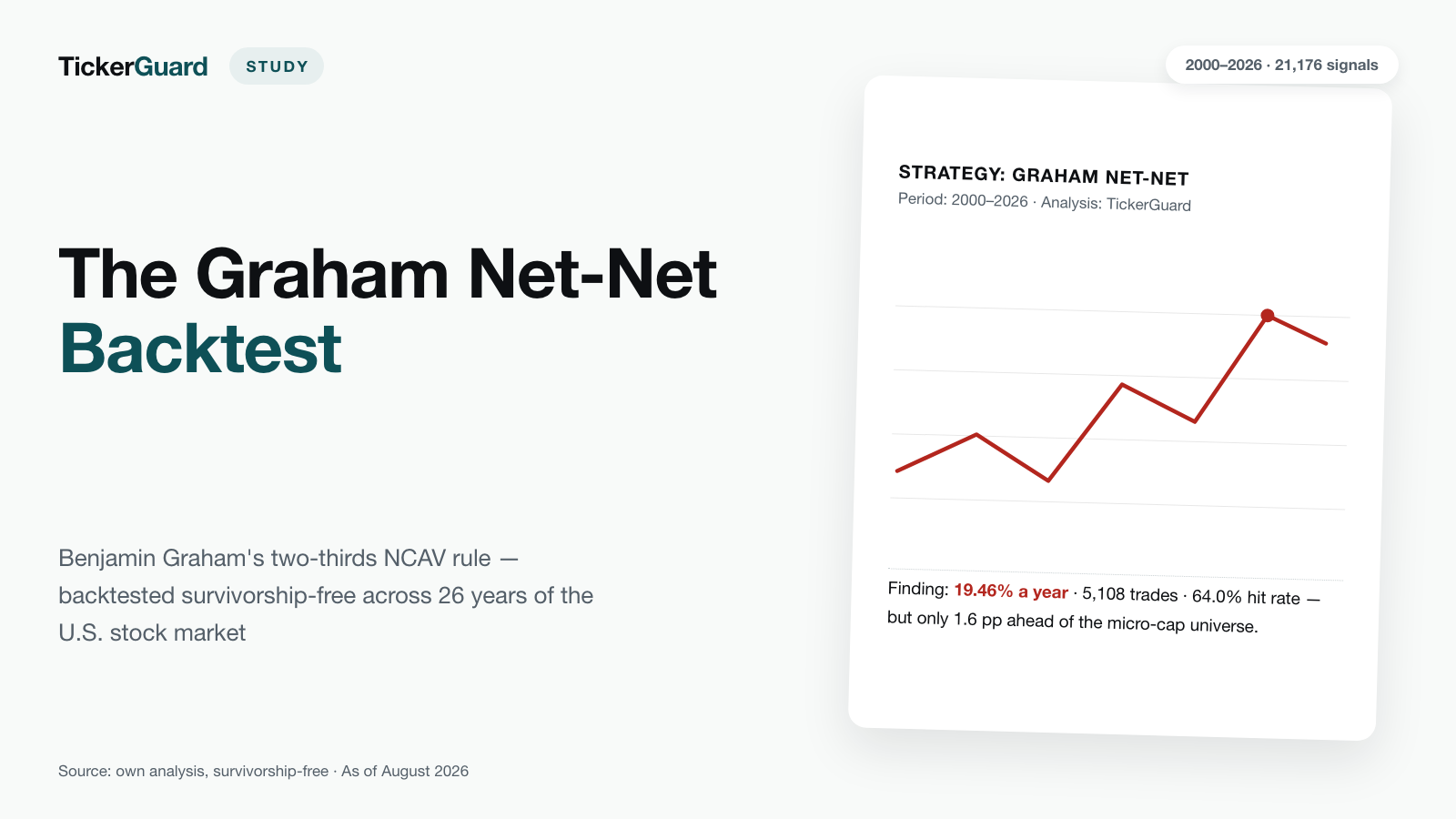
Benjamin Graham's strictest value rule sounds like value investing in its purest form: buy any stock trading for no more than two-thirds of what would be left if the company sold its current assets at book value and paid off every liability. We backtested it across the entire U.S. stock market since 2000, survivorship-free and including every company that has since been delisted: 19,122 signals, 4,868 completed trades in the primary run, 16.44% annual return. The uncomfortable part of the finding: an equal-weight basket of every small and micro-cap U.S. stock — with no balance-sheet screening at all — returned 17.63% over the same period, and comes out ahead.
 Thomas Mücke
Founder & Publisher
Thomas Mücke
Founder & Publisher
Graham's Strictest Rule: Two-Thirds of Net Current Assets
Benjamin Graham, Warren Buffett's teacher and the founder of security analysis as its own discipline, formulated a rule in the 1930s so simple it borders on absurd: buy a stock only when its entire market capitalization is no more than two-thirds of what would be left if you sold the company's current assets at book value and used the proceeds to pay off every liability and every dollar of preferred stock. That figure is called Net Current Asset Value, or NCAV. A stock meeting this bar trades for less than its current assets minus all liabilities alone — the actual operating business, fixed assets, and goodwill come thrown in for free.
Graham himself described this rule as mechanical and diversified — not an analysis of individual business models, but a statistical bet on a large basket of extremely cheap stocks. That is exactly what we tested: not against a handful of well-known examples, but across the entire U.S. stock market since 2000, survivorship-free — meaning every company that has since disappeared from the exchange, through acquisition, bankruptcy, or delisting, stays in the sample. Counting only the survivors flatters the past.
The result in four numbers
Does Graham's strictest value rule — buy when market cap is no more than two-thirds of net current asset value — beat the market? We tested it across the entire U.S. stock market from 2000 to 2026, survivorship-free. Four numbers carry the result:
- 16.44% a year is what the primary run (Graham's original rule, 1% trading cost, delisted positions closed at the last traded price) returned from January 2000 through June 2026, across 4,868 completed trades.
- 17.63% a year is what the equal-weight small/micro-cap universe the formula selects from returned — about 1.2 percentage points AHEAD of the formula. The selection rule added nothing.
- 8.46% a year is what the S&P 500 (SPY proxy) returned over the same period — a flattering comparison, but the unfair one: it pits entirely different company sizes against each other.
- 12.68% a year is what the most important counter-check returned: the same run under the pessimistic assumption "delisting = total loss" instead of the last traded price.
Over the 2000-to-2026 test window, the net-net formula's return was essentially the general micro-cap premium; the balance-sheet selection itself trailed the universe it drew from.
What We Tested: Two Recipes, One Exit Rule
We ran two versions of the buy rule against each other:
- Original — Graham's rule in its purest form: market cap no more than two-thirds of net current asset value (NCAV = current assets minus all liabilities minus preferred stock at liquidation value). No further conditions.
- Scanner variant — the same two-thirds rule, plus two additional guardrails, matching what our live scanner actually applies: a minimum market cap of $20 million (below that, neither tradability nor data quality can be relied on) and a positive NCAV in the prior period too, so a single bad accounting year can't manufacture a false positive. One approximation worth stating openly: the live scanner checks the prior period quarterly, while the backtest only has annual filings and therefore compares against the prior year — the scanner variant in this backtest reacts more sluggishly than it does live.
Positions are sold following Graham's own rule of thumb, described in "The Intelligent Investor" (Chapter 15): once a position is up 50%, or after two years at the latest, whichever comes first. That is the primary run of this study. We also systematically tested other holding periods and profit thresholds (below), but Graham's own rule remains the reference point.
Trading runs through a 20-slot portfolio, refilled monthly from the currently active signals. When there aren't enough candidates to fill every slot, the remainder sits in cash, unremunerated — a deliberately conservative choice, since a money-market rate would have added a noticeable return contribution over 26 years without the strategy itself having earned it. To avoid depending on the luck of a single starting month, every combination runs across twelve cohorts, each starting one month apart; the figures reported here are their average.
Setup: Survivorship-Free Over 26 Years
The backtest covers January 2000 through June 2026, deliberately starting in 2000 because annual-report coverage thins out sharply before that — a test that populates its early years only with companies that still existed later would be measuring survivors, not real returns. We evaluated 185,030 annual filings, of which 88,865 passed all quality checks; the rest were excluded for reasons including a missing anchor price, missing current-asset data, a stale share-count figure, currency issues — or, new since 8 August 2026, because the security turned out to be a warrant. In the end, 1,217 distinct stocks triggered at least one signal — 19,122 signals in total under the original rule, of which 7,299 additionally satisfy the stricter scanner variant (the scanner variant is a subset of the original, not an additional pool of signals).
The Result: 16.44% a Year
The table below shows the primary run — Graham's original rule, exit at +50% or two years, 1% round-trip trading cost, delisted positions closed at the last traded price — against two reference series.
| Metric | Portfolio (primary run) |
|---|---|
| Annualized return (2000-01 to 2026-06) | 16.44% |
| Volatility | 23.60% |
| Maximum drawdown | −58.86% |
| Hit rate per trade | 63.99% |
| Average return per trade | +24.68% |
| Median return per trade | +48.64% |
| Average holding period | 14.4 months |
| Delisting rate | 4.44% |
| Average cash allocation | 27.29% |
| Completed trades | 4,868 |
| Reference series | Annualized return |
|---|---|
| Equal-weight small/micro-cap universe | 17.63% |
| S&P 500 (SPY proxy) | 8.46% |
At first glance, a win: a good 16% a year over 26 years, with almost two-thirds of all trades landing as winners and roughly double the S&P 500's return. The high average cash allocation of 27.29% comes directly from the fixed 20-slot portfolio: in quiet market phases there simply aren't enough net-net candidates to fill every slot, and the unfilled remainder earns nothing — the strategy generates its return with less than the full capital deployed.
The Most Important Finding: The Formula Does Not Beat Its Own Universe
This is the crux of the study, and it belongs front and center rather than buried in a footnote: a simple, equal-weight basket of every small and micro-cap U.S. stock — bought with no balance-sheet screening, no net-net rule, no selection at all — returned 17.63% a year over the same period. The net-net portfolio returned 16.44%. The selection rule therefore trails the universe it selects from by roughly 1.2 percentage points a year.
That is the honest answer to what Graham's formula actually earns: the return of this strategy is the historical premium for being invested in very small, under-followed stocks — a long-documented effect that has nothing to do with balance-sheet analysis. Picking the cheapest of those small stocks by the numbers adds nothing in this test; it costs. What it buys instead is a far narrower, less liquid selection and a high unremunerated cash balance, because there frequently aren't enough candidates to go around.
The comparison against the S&P 500 (8.46%) looks far more flattering — but it is the unfair one. The S&P 500 is made up of the country's largest, most established companies, while net-nets are almost always micro- and nano-caps in financial distress. Pitting two entirely different risk classes against each other inflates how impressive the strategy looks. The honest yardstick is the equal-weight small/micro-cap universe — and measured against that, nothing is left of the net-net formula.
One addition that shouldn't get lost: the micro-cap universe is a yardstick, not an investment proposal. It contains several thousand names and would carry the same bid-ask spreads and tradability problems that weigh on the net-net strategy further below. The comparison says the selection rule itself contributes nothing — not "buy every micro-cap instead".
Update of 8 August 2026: Warrants Removed From the Test
This study has carried new figures since 8 August 2026, and its most important statement reversed in the process. The reason is a cleanup that was missing before — and it belongs stated openly, not quietly folded in.
Reviewing individual purchase charts, it turned out that some of the "stocks" bought were not stocks at all but warrants: the subscription rights issued alongside common stock when a blank-check company (SPAC) completes a merger, listed under their own ticker — typically the company ticker with a W appended. In the price data they carry the same security type as common stock, while the balance-sheet metrics the backtest attaches to them come from the company behind them. A warrant trading for a few cents while the company behind it reports a full net current asset value satisfies the two-thirds rule almost automatically — and is still not a net-net, but a derivative with an expiry date.
This affected 696 of the original 5,108 purchases — 13.6%, spread across 46 distinct securities. They are now excluded entirely, and in both places: from the portfolio and from the benchmark. The equal-weight micro-cap index the strategy is measured against contained 121 such warrants too. Cleaning only the portfolio while leaving the benchmark untouched would mean measuring two different universes against each other and calling the result precision.
What changed as a result:
| Metric | before (as of 7 August) | now (as of 8 August) |
|---|---|---|
| Annualized return, primary run | 19.46% | 16.44% |
| Equal-weight micro-cap universe | 17.89% | 17.63% |
| Formula's gap to the universe | +1.6 pp | −1.2 pp |
| Completed trades | 5,108 | 4,868 |
| Delisting rate | 7.05% | 4.44% |
| Signals under the original rule | 21,176 | 19,122 |
The core finding did not weaken; it reversed. A thin lead over the micro-cap universe became a deficit. That the number of completed trades falls by only 240 rather than 696 is down to the fixed 20 portfolio slots: where a warrant drops out, another candidate moves in — the portfolio stays the same size, it simply buys something else. And the delisting rate falls sharply because warrants expire or get redeemed, which the test counted as leaving the exchange; a substantial share of the reported delisting risk was never equity risk at all.
One limit of this cleanup belongs on the record: warrants are covered. Subscription rights, units (share and warrant bundled together) and subordinated notes of the same pattern remain in the test, accounting for 108 purchases across five securities — 2.2%. There is no detection rule for them that would not also sweep out legitimate common stock: listed companies exist whose ticker or corporate name looks exactly the same. We accepted this small, disclosed remainder rather than a rule that quietly discards correct data too.
Year by Year
The portfolio's annual returns against both reference series show how unevenly the return is distributed — concentrated in a handful of often highly volatile years, not spread evenly across 26 years:
| Year | Portfolio | S&P 500 (SPY proxy) | Small/micro-cap universe |
|---|---|---|---|
| 2000 (partial) | 0.00% | −5.01% | 12.69% |
| 2001 | 40.70% | −11.76% | 28.85% |
| 2002 | 1.11% | −21.58% | 2.27% |
| 2003 | 131.38% | 28.18% | 82.43% |
| 2004 | 31.51% | 10.70% | 33.99% |
| 2005 | 11.02% | 4.83% | 13.61% |
| 2006 | 17.12% | 15.85% | 26.37% |
| 2007 | −6.52% | 5.15% | 4.97% |
| 2008 | −44.66% | −36.79% | −36.37% |
| 2009 | 123.15% | 26.35% | 80.42% |
| 2010 | 47.34% | 15.06% | 34.70% |
| 2011 | −11.61% | 1.90% | −0.63% |
| 2012 | 48.15% | 15.99% | 23.47% |
| 2013 | 53.84% | 32.31% | 44.94% |
| 2014 | −1.59% | 13.46% | 11.33% |
| 2015 | −17.99% | 1.23% | 12.25% |
| 2016 | 62.75% | 12.00% | 25.83% |
| 2017 | 2.37% | 21.71% | 20.01% |
| 2018 | −3.68% | −4.57% | −11.81% |
| 2019 | 6.76% | 31.22% | 24.95% |
| 2020 | 38.12% | 18.33% | 39.55% |
| 2021 | 3.94% | 28.73% | 26.53% |
| 2022 | −18.42% | −18.18% | −23.96% |
| 2023 | 36.68% | 26.18% | 6.17% |
| 2024 | 0.13% | 24.89% | 17.77% |
| 2025 | 7.77% | 17.72% | 25.44% |
| 2026 (partial) | 5.36% | 10.09% | 10.60% |
The earliest of the twelve cohorts already buys in January 2000; the averaged curve shown here, however, only starts in December 2000, because only from then on are all twelve monthly-offset portfolios running. The partial year 2000 therefore shows 0.00% — the ramp-up phase, not a gap in the data.
The annual series explains where the deficit comes from. In 17 of the 27 years shown (both partial years included) the net-net portfolio trails the micro-cap universe; in ten it leads. The leads are large but rare: 2003 (131.38% against 82.43%), 2009 (123.15% against 80.42%), 2016 (62.75% against 25.83%) and 2023 (36.68% against 6.17%) carry the lion's share. In between lie long stretches where the stricter selection simply costs — 2014 to 2015, 2017, 2019 to 2021, and 2024 to 2025 all see the portfolio lose to a universe it selects from itself. It is also striking that the portfolio's big years are almost always big micro-cap years: a substantial share of the strong phases were good years for small stocks in general, not for net-nets specifically.
Dispersion across the twelve monthly-offset starting cohorts is moderate for the primary run: annualized return ranges from 14.80% to 17.01% depending on the start month, and maximum drawdown from −58.90% to −58.85%. The result does not hinge on one luckily chosen starting point — and even the best of the twelve cohorts stays below the micro-cap universe's return.
Exit Sensitivity: The Original Rule Remains the Reference
We systematically tested alternative profit thresholds and holding periods, all at 1% round-trip trading cost:
| Recipe | +50% / 2 years (original) | +50% / 1 year | +50% / 3 years | +100% / 2 years | 2 years only, no threshold |
|---|---|---|---|---|---|
| Original | 16.44% | 27.76% | 12.06% | 15.27% | 16.04% |
| Scanner variant | 22.02% | 20.71% | 20.60% | 22.72% | 16.33% |
A shorter one-year holding period would arithmetically lift the original rule to 27.76% a year — but it would also more than double volatility, from 23.60% to 55.39%, while the maximum drawdown stays essentially unchanged (−56.63% versus −58.86%). The higher return is bought with a considerably rougher ride. We stick with Graham's own +50%-or-two-years rule as the headline result because it is the actual, documented original prescription — not the best combination cherry-picked from a larger search space after the fact. The other variants stand alongside as sensitivity checks, not as a replacement for the primary result.
Stop-Loss: Why a Fixed Loss Limit Hurts This Strategy
On top of Graham's original exit rule (+50% price target or a 2-year holding limit), we tested ten loss limits from −5% to −50%, in 5-percentage-point steps — everything else identical: same portfolio, same period, same costs.
| Stop | Win Rate | Avg. Return per Trade | Median | Avg. Holding Period | Avg. Actual Stop Loss |
|---|---|---|---|---|---|
| None (original) | 63.99% | 24.68% | 48.64% | 14.4 mo. | — |
| −5% | 21.67% | 5.50% | −8.41% | 2.9 mo. | −15.15% |
| −15% | 33.48% | 8.53% | −17.10% | 4.4 mo. | −24.21% |
| −35% | 50.46% | 16.46% | 0.61% | 7.2 mo. | −44.07% |
| −50% | 55.22% | 22.41% | 18.54% | 8.7 mo. | −57.03% |
The table shows four of the ten thresholds tested: the tightest (−5%), a tight one (−15%), a middle one (−35%), and the widest (−50%). The win rate rises without a break across all ten thresholds; the average return per trade rises overall as the threshold widens, but dips between −10% and −15%.
Every threshold makes the individual trade worse, cleanly in one direction: the win rate drops from 63.99% with no stop to between 21.67% and 55.22%, tighter thresholds hurting more. At every threshold tighter than −35%, even the median trade is a loss. The reason is straightforward — the stop sells off exactly the stocks that only turn around after a setback, which is what this strategy depends on.
The threshold itself is never actually honored. Net-net candidates are small and thinly traded and fall through the line via price gaps: across all ten thresholds, the actually realized loss runs 7.0 to 10.2 percentage points below the stated line — with a −50% stop, the trade ends at −57.03% on average rather than −50%.
The strongest argument against the stop, though, sits at the portfolio level rather than the trade level: every single one of the ten thresholds raises volatility. With no stop the portfolio swings at 23.60% a year; with a stop, between 26.79% (at −20%) and 62.52% (at −10%). Anyone adding a stop as a safety net gets the opposite in this test: a rougher ride. The reason is turnover — with a tight stop the number of trades rises from 4,868 to as many as 22,222, and the portfolio is permanently busy swapping positions.
At first glance the portfolio return still argues for the stop: eight of the ten thresholds tested come out above the main run, the widest threshold of −50% by 7.05 percentage points a year (23.50% against 16.44%). It is still not reliable, for three reasons. First, the series jumps with no direction: from 15.99% at −5% up to 19.13% at −10%, back down to 16.82% at −15% and 15.79% at −20%, then upward again — the gap to the main run changes sign three times, and two thresholds actually land below it. Second, the largest of those jumps (3.1 percentage points between −5% and −10%) is bigger than the entire spread across the twelve starting cohorts of one and the same threshold (1.6 to 2.7 percentage points); the difference between two thresholds therefore rests on no better evidence than the difference between twelve starting months. Third, every metric driven directly by the rule — win rate, holding period, stop frequency, actual stop loss, number of trades — moves cleanly and without exception in one direction, while the portfolio-level metrics are precisely the ones that jump.
The mechanism behind that is well understood and has nothing to do with the rule: a stop sells earlier and therefore frees one of the twenty portfolio slots earlier. A different stock moves into that slot than would have without the stop — and its path helps decide the outcome. Over 26 years, a tiny shift in slot occupancy travels a very long way. What is being measured here is which stocks happened to land in the twenty slots, not the effect of the stop; no recommendation can be derived from it.
The one consistent effect is the expected one: fewer delistings end up in the portfolio (the rate falls from 4.44% to between 0.92% and 3.04%), because the stop sells many stocks before they can leave the exchange at all. That comes at the cost of clearly worse trades and a rougher portfolio — not a good trade-off.
Stops were checked against closing prices, same as the profit target — real intraday lows would breach the threshold more often. The reported stop-out rates are therefore lower bounds, not upper ones, and the bias runs consistently in the stop's favour.
Bottom line: Graham's original exit rule stays as-is. A stop-loss doesn't fit a strategy that deliberately buys battered, volatile stocks and bets on their recovery — it cuts loose exactly the positions that were supposed to deliver that recovery.
Trading-Cost Sensitivity: The Core Issue for Micro-Caps
Net-nets are almost always micro- and nano-caps — precisely the stock category where real-world bid-ask spreads and market impact on entry matter most. The table below shows the same strategy at different round-trip trading costs (buy plus sell combined, as a percentage of trade value); "tiered" sets the cost rate by market cap at purchase, ranging from 5% below $25 million to 0.8% above $500 million.
| Recipe · exit | 0% cost | 1% | 2% | 5% | tiered by size |
|---|---|---|---|---|---|
| Original · +50% / 2 years | 17.36% | 16.44% | 15.54% | 12.90% | 14.01% |
| Original · +50% / 1 year | 29.37% | 27.76% | 26.18% | 21.56% | 23.62% |
| Original · +50% / 3 years | 12.68% | 12.06% | 11.44% | 9.61% | 10.47% |
| Original · +100% / 2 years | 15.99% | 15.27% | 14.55% | 12.43% | 13.39% |
| Original · 2 years only | 16.30% | 16.04% | 15.50% | 14.13% | 14.47% |
| Scanner variant · +50% / 2 years | 22.82% | 22.02% | 21.22% | 18.87% | 20.69% |
| Scanner variant · +50% / 1 year | 21.84% | 20.71% | 19.60% | 16.35% | 18.95% |
| Scanner variant · +50% / 3 years | 21.28% | 20.60% | 19.93% | 17.95% | 19.47% |
| Scanner variant · +100% / 2 years | 23.38% | 22.72% | 22.06% | 20.12% | 21.59% |
| Scanner variant · 2 years only | 16.82% | 16.33% | 15.84% | 14.39% | 15.53% |
For the primary run, going from 0% to 5% round-trip cost costs 4.46 percentage points of annual return — 17.36% versus 12.90%. Anyone trying to actually implement this strategy would need to check, name by name, whether the real bid-ask spread is closer to 1% or closer to 5%; for the smallest names under the tiered cost assumption (below $25 million market cap), the higher figure is the rule rather than the exception. And this belongs with the core finding: even with completely free trading, the primary run's 17.36% stays below the micro-cap universe.
Delisting Assumption: Total Loss as the Floor
When a position in the portfolio ends in a delisting — the company being taken off the exchange through acquisition, bankruptcy, or withdrawal — the primary run continues to value it at the last actually traded price. That is a generous assumption, since not every delisting can realistically be sold at that exact price. As a mandatory counter-check, we therefore also ran the same scenarios under the assumption "delisting = total loss":
| Recipe · cost | Last traded price | Total loss | Difference | Delisting rate |
|---|---|---|---|---|
| Original · 0% | 17.36% | 13.54% | −3.82 pp | 4.44% |
| Original · 1% | 16.44% | 12.68% | −3.77 pp | 4.44% |
| Original · 2% | 15.54% | 11.82% | −3.72 pp | 4.44% |
| Original · 5% | 12.90% | 9.32% | −3.58 pp | 4.44% |
| Original · tiered | 14.01% | 10.41% | −3.59 pp | 4.44% |
| Scanner variant · 0% | 22.82% | 20.35% | −2.47 pp | 4.83% |
| Scanner variant · 1% | 22.02% | 19.57% | −2.44 pp | 4.83% |
| Scanner variant · 2% | 21.22% | 18.80% | −2.42 pp | 4.83% |
| Scanner variant · 5% | 18.87% | 16.53% | −2.34 pp | 4.83% |
| Scanner variant · tiered | 20.69% | 18.32% | −2.36 pp | 4.83% |
For the primary run (1% cost), the return falls from 16.44% to 12.68% a year under this pessimistic assumption — the truth is likely somewhere between the two figures, since a delisting doesn't automatically mean a total loss (acquisitions, for instance, often pay a premium), but it doesn't always mean the last traded price either. That range is markedly narrower than before the warrant exclusion: it used to be 8.13 percentage points, now it is 3.77 — the expiring warrants had heavily overstated the portfolio's delisting risk.
Contrary to the obvious expectation, the scanner variant's size filter does not reduce the delisting rate: at 4.83% it sits slightly above the original rule's 4.44%. What it changes is the severity — the return hit under the total-loss assumption is only 2.44 percentage points instead of 3.77. The minimum market cap does not screen out the number of exchange exits; it ensures that more residual value is left in the price when one happens.
In the primary run, 51.13% of all 4,868 trades closed by hitting the profit threshold, 39.50% closed after the holding period expired, 4.44% closed via delisting at the last traded price, and 4.93% were force-closed at the edge of the available data.
The AI Traffic Light: Does Filing Quality Predict Returns?
Beyond the backtest's core numbers, we had an AI render a quality verdict for each of the 237 purchased stocks — a traffic light of red, yellow, or green. The verdict was based solely on material already available on the purchase date — as a rule the annual filing — under a strict blind protocol: the model could only use what was written in the filing itself, nothing that happened afterward. Because many stocks were bought in more than one year, this produced 381 individual verdicts across the 237 names. Red marks a solvency risk documented in the filing, yellow an open operational question with no clear finding, and green a documented quality signal — the stock's price never enters into the color.
Grouping the actually traded trades from the main run by the traffic light in effect on their purchase date gives this picture. The reason 381 verdicts correspond to 4,868 trades is the twelve monthly-offset starting cohorts: the same stock gets bought in several cohorts, and the same verdict applies to each of those purchases. Both delisting columns are shares of all trades in that colour — not shares of the delistings.
| Light at Purchase | Trades | Win Rate | Avg. Net Return | Median Net | Delisting Rate | Delisting with Loss |
|---|---|---|---|---|---|---|
| Red | 1,299 | 55.43% | 18.36% | 50.08% | 5.54% | 3.70% |
| Yellow | 2,992 | 65.64% | 27.31% | 48.70% | 3.61% | 2.41% |
| Green | 577 | 74.70% | 25.29% | 45.59% | 6.24% | 6.24% |
| Total | 4,868 | 63.99% | 24.68% | 48.64% | 4.44% | 3.20% |
As a gauge of the success rate, the traffic light works cleanly and in the expected direction: the win rate rises without a break from red (55.43%) through yellow (65.64%) to green (74.70%). Anyone asking how likely a single trade is to end in the black gets a usable answer from the colour.
As a return filter, it does not order anything. The lowest average return per trade belongs to the red stocks (18.36%), the maximum sits at yellow (27.31%), and green lands in between at 25.29%. Red is therefore the weakest of the three groups — but the red-yellow-green sequence isn't run in reverse, it isn't run at all: the best value sits in the middle. A filter deriving a return expectation from the colour has nothing to stand on here.
One detail rewards a second look, because it connects the two findings: the median runs exactly opposite to the average. It falls from red (50.08%) through yellow (48.70%) to green (45.59%). The typical red trade is therefore no worse than the typical green one — the red group's average is dragged down by comparatively few but heavy losses. The win rate measures the same thing: with red, nearly every second trade ends in the red.
Delisting risk the traffic light does not order at all — in neither direction. Both delisting columns are U-shaped with yellow as the minimum: the delisting rate is 5.54% for red, 3.61% for yellow, and 6.24% for green; for loss-making delistings it is 3.70% (red), 2.41% (yellow), and 6.24% (green). Red stocks leave the exchange more often than yellow ones, but less often than green ones. The sample size belongs with those green peaks: behind the 577 green trades stand just 39 distinct stocks with 48 verdicts — a group small enough that a handful of special cases could be shaping the picture.
This finding reversed with the warrant exclusion, and that belongs on the record: before the cleanup, red delivered the highest average return per trade at 33.60% — which read like a risk premium. It is now 18.36%, and red is the weakest group. The reason is where the excluded warrants sat: overwhelmingly among the red names. Of the red purchase dates, 17.0% were warrants, against 7.2% for yellow and 4.5% for green. The apparent risk premium was in large part the leverage of derivatives counted as shares.
Three caveats apply to this finding. First, this is a grouping of trades that were actually executed, not a simulation of a portfolio that deliberately excluded red stocks — what such a portfolio would have earned remains an open question. Second, for 119 of the 381 verdicts no annual filing could be found at all (net-nets are often old, now-delisted micro-caps); those verdicts rest only on the raw financial figures rather than the full filing. Third, there remains a residual risk that the judging model recognized well-known companies despite the blind protocol and let that knowledge shape its verdict, even unintentionally.
Data Quality: Ghost Prices and Outliers Filtered Out
Net-nets are almost by definition micro-caps with thin price-data histories — and that is exactly where raw data regularly contains errors that a balance-sheet formula like this one is especially prone to exploit: a spuriously recorded phantom price shortly before an IPO makes a market cap look tiny and can make the stock falsely appear to be an extreme bargain. An automated data-quality check systematically identified and cleaned such corrupted price series before any signals were computed:
| Metric | Value |
|---|---|
| Stocks with identified and cleaned price series | 219 |
| Discarded, unusable monthly data points | 12,478 |
| Individual outlier prices removed | 925 |
Without this cleanup, the result would have been grotesquely inflated: an initial, unfiltered run before cleaning produced an obviously nonsensical return of 308.63% a year — a clear sign that corrupted price data was disproportionately slipping through as false net-net signals. Every figure reported here comes exclusively from the cleaned run, and since 8 August 2026 additionally from a run without warrants.
Daily Price Coverage: Not Every Exit Is Pinpointed to the Day
Whether the 50% profit threshold has been hit is checked most precisely with daily prices. Of the 1,217 stocks that produced a signal at all — and could therefore ever enter the portfolio — 803 (65.98%) actually have daily price series; for the rest, the profit threshold had to be checked against monthly data instead. Measured across the full evaluation universe of 7,892 stocks checked, coverage stands at 4,678 series, or 59.28%. The missing daily resolution can shift the actual exit date slightly compared to a day-precise check — usually by a few days, occasionally more if the threshold is briefly crossed and re-crossed mid-month. For roughly two-thirds of the tradable stocks, the result is therefore day-precise; for the rest, it is checked on a monthly basis.
Point-in-Time Cleanliness
A backtest that uses figures which weren't actually published yet at the time systematically overstates itself. We therefore used only metrics that were genuinely available at the time of the signal. What governs that is not the fiscal year-end but the recorded availability date of the filing: on average it falls 72 days after the balance-sheet date, and for 13,804 of the 88,865 usable filings exactly 90 days after it. A filing also counts as "stale" and no longer produces a signal once it is older than 18 months — so no stock keeps triggering signals for years on a company's last available numbers when that company may no longer exist in that form.
The share-count series used carries figures exclusively as of December 31. For companies with a different fiscal year-end, the 180-day tolerance between the balance-sheet date and the share-count date means that 14,980 annual filings (8.1% of everything evaluated) drop out of the calculation because the available share count sits too far from the balance-sheet date; a further 14,135 filings carry no share count at all — a deliberate choice against imprecise market caps, at the cost of a certain number of missed signals.
And finally: the universe is survivorship-free. Every company that has since disappeared from the exchange remains in the test for as long as it existed and reported data at the time.
Comparability Gap to the Live Scanner
One point that needs to be stated plainly, because it limits how directly this study compares to our running net-net scanner: Graham's original formula, when computing net current asset value, also deducts a company's preferred stock — logically so, since preferred shareholders rank ahead of common shareholders in a wind-down. This backtest applies that same deduction. For current live hits, however, the figure required for it has not been reliably available since 2024. In practice, that means current live hits from the scanner can run somewhat "softer" for companies with meaningful preferred stock than the historical signals tested here — they may only satisfy the two-thirds rule because the preferred stock that should have been deducted is missing from the data.
Limits of This Study
Six caveats belong in any honest account of this result:
- The formula trails its own universe — the most important finding of this study, discussed above. The return is the general small-cap premium; in this test the balance-sheet formula costs roughly 1.2 percentage points a year rather than contributing anything.
- The warrant cleanup is not complete. SPAC warrants are excluded; subscription rights, units and subordinated notes of the same pattern, accounting for 108 purchases (2.2%), are not — there is no rule for them that would not also catch legitimate common stock.
- Trading costs help decide the level. At realistic micro-cap spreads, the return shrinks noticeably; anyone trying to implement this strategy for real would need to check the actual tradability of every single name.
- The delisting assumption is a range, not a point estimate. For the primary run, the gap between "last traded price" and "total loss" is 3.77 percentage points a year.
- Comparability gap to the live scanner. The missing preferred-stock deduction since 2024 makes current live signals tend to run softer than the ones tested here.
- The S&P 500 comparison is an approximation. In the absence of an available total-return series, the dividend-adjusted price series of the SPY ETF was used as a proxy, not an official total-return index series.
The strategy tested here runs as its own continuously updated scanner using the rules shown above. Further in-house backtest studies are available in the Studies section.
Figures as of August 8, 2026.
This article is a historical analysis of a publicly known investment rule and does not constitute investment advice. It contains no buy or sell recommendation, no forecast, and no statement about any individual, currently listed company. Past results — whether simulated or real — are not a reliable indicator of future returns. Anyone making investment decisions should assess their own situation and risks, seeking professional advice if in doubt.
Frequently Asked Questions
A stock trading on the market for no more than two-thirds of what would be left if the company sold its current assets at book value and used the proceeds to pay off all liabilities and all preferred stock (Net Current Asset Value, or NCAV). The actual operating business and fixed assets come thrown in for free at that price. The rule was formulated by Benjamin Graham in the 1930s.
Two versions of the buy rule — Graham's original with no further conditions, and a stricter scanner variant with a $20 million minimum market cap and a clean prior period — each selling at +50% profit or after two years at the latest, across the entire U.S. stock market from 2000 to 2026, survivorship-free and including every stock later delisted.
The primary run (original rule, 1% trading cost, delisted positions closed at the last traded price) delivers 16.44% annualized return across 4,868 completed trades, with a 63.99% hit rate. The S&P 500 returned 8.46% over the same period. The equal-weight micro-cap universe the formula selects from, however, returned 17.63% — ahead of the net-net portfolio.
Small stocks in general. An equal-weight basket of every small and micro-cap U.S. stock, with no balance-sheet screening at all, returned 17.63% a year over the same period against the net-net portfolio's 16.44% — the selection rule therefore trails by roughly 1.2 percentage points a year. The return comes from the historical premium for holding very small, under-followed stocks, not from picking the cheapest ones by the numbers.
Because 696 of the original 5,108 purchases (13.6%, across 46 securities) were not shares but SPAC warrants — subscription rights that the price data carries under the same security type as common stock, while the balance-sheet figures attached to them come from the company behind them. That makes them satisfy the two-thirds rule almost automatically without ever being net-nets. They have now been removed from both the portfolio and the benchmark; the primary run's return falls from 19.46% to 16.44% a year, and the lead over the micro-cap universe flips into a deficit.
Substantially. At zero trading costs, the primary run's return is 17.36% a year; at 5% round-trip cost — realistic for very small, illiquid stocks — it drops to 12.90%. Net-nets are almost always micro-caps, where real bid-ask spreads can consume a meaningful share of the theoretical return.
The primary run continues to value it at the last actually traded price — a generous assumption. As a counter-check, the same run was repeated under the pessimistic assumption "delisting = total loss": the return then drops to 12.68% a year. That's the floor; the truth is likely somewhere in between.
Not quite one-to-one. The backtest correctly deducts preferred stock from net current assets, as Graham's rule requires. For current live hits, the figure needed for that deduction has not been reliably available since 2024 — live hits for companies with preferred stock can therefore run somewhat "softer" than the signals tested here.
Not in this backtest. We tested ten loss limits between −5% and −50%. Every single one lowers the win rate of the individual trade, every single one raises portfolio volatility (from 23.60% with no stop to between 26.8% and 62.5%), and the threshold is never honored anyway because of price gaps. Eight of the ten thresholds do show higher portfolio-level annual returns, up to +7.05 percentage points at −50% — but that is not reliable: the figures jump between neighbouring thresholds with no direction and change sign three times, while every rule-driven metric moves cleanly in one direction. We are sticking with Graham's original exit via price target and holding limit, with no added stop-loss.
Not in this backtest. Stocks with a documented solvency risk in their filing (red light) are the weakest of the three groups at 18.36% net return per trade; yellow performs best (27.31%), with green in between at 25.29%. On the win rate, by contrast, the traffic light orders cleanly: 55.43% for red, 65.64% for yellow, 74.70% for green. Delisting risk it does not order at all — the rate is U-shaped with yellow as the minimum (3.61%) and green as the maximum (6.24%), the green side resting on a small sample. Whether a portfolio that deliberately avoided red stocks would do better in practice is not answered here — that would require an actual simulation.